Last edited:
Nosferatu (2024) (4K+2D Blu-ray SteelBook) (Collector's Edition) [UK]
- Thread starter Billy Talent
- Start date
You are using an out of date browser. It may not display this or other websites correctly.
You should upgrade or use an alternative browser.
You should upgrade or use an alternative browser.


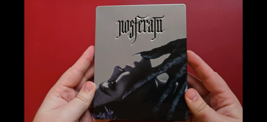
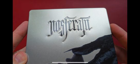


Mine arrived today. I quite like it in hand tbh. The silver does work okay, as the bottom half of the poster is kinda blurray anyway, so something about it isn't as bad as i thought. Still feels relatively premium. The debossing is still a bit eh, but again, feels better in hand than I expected from the video.
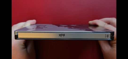
The slip is nice enough. Soft touch. Only spot gloss is on the front text and spine title. Blacks are nice and inky, but the rear image is darker than the poster and previous steel. Extras are nice, particularly the character cards and the booklet content.
To sum up, I'll keep it, but the steel should've been white and intricately debossed, and it should've been a fiver cheaper.
It’s better in hand for me too but that steel debossing has still urked me the wrong way. Also disappointed the back is dark, was really hoping it would be as vibrant as the poster version and the original steel because I do really like that shot. I’m still undecided tbh. I’ll get some photos soon now the sinners pre order is out the wayMine arrived today. I quite like it in hand tbh. The silver does work okay, as the bottom half of the poster is kinda blurray anyway, so something about it isn't as bad as i thought. Still feels relatively premium. The debossing is still a bit eh, but again, feels better in hand than I expected from the video.
The slip is nice enough. Soft touch. Only spot gloss is on the front text and spine title. Blacks are nice and inky, but the rear image is darker than the poster and previous steel. Extras are nice, particularly the character cards and the booklet content.
To sum up, I'll keep it, but the steel should've been white and intricately debossed, and it should've been a fiver cheaper.
Me too r.e the debossing. It's not terrible though. Not like the UK little Mermaid 4k steel, for example. That's bloody awful. Just one big stamp out of the front. Same with the slip rear, it's not terrible and it's fitting the contrast of the front. At least it's brighter on the poster. Not the total dumpster fire I expected.It’s better in hand for me too but that steel debossing has still urked me the wrong way. Also disappointed the back is dark, was really hoping it would be as vibrant as the poster version and the original steel because I do really like that shot. I’m still undecided tbh. I’ll get some photos soon now the sinners pre order is out the way
What little mermaid steel is that?Me too r.e the debossing. It's not terrible though. Not like the UK little Mermaid 4k steel, for example. That's bloody awful. Just one big stamp out of the front. Same with the slip rear, it's not terrible and it's fitting the contrast of the front. At least it's brighter on the poster. Not the total dumpster fire I expected.
Hi, is there a numbering as expected ?Mine arrived today. I quite like it in hand tbh. The silver does work okay, as the bottom half of the poster is kinda blurray anyway, so something about it isn't as bad as i thought. Still feels relatively premium. The debossing is still a bit eh, but again, feels better in hand than I expected from the video.
The slip is nice enough. Soft touch. Only spot gloss is on the front text and spine title. Blacks are nice and inky, but the rear image is darker than the poster and previous steel. Extras are nice, particularly the character cards and the booklet content.
To sum up, I'll keep it, but the steel should've been white and intricately debossed, and it should've been a fiver cheaper.
Yes. Out of 3,000 unitsHi, is there a numbering as expected ?

Eugh, I'd avoided that release because I didn't like the art they'd used so I wasn't aware it was debossed but it's not pretty.
I recently ordered Clown in a cornfield and that has the same debossing of the title by area but it seems to work quite well there.
Last edited:
Yep. It's awful on the front tbh. I remember the US title being intricately debossed though, which was annoying. The UK one did have a fantastic Embossed rear though, so it's a 50/50.Eugh, I'd avoided that release because I didn't like the art they'd use so I wasn't aware it was debossed but it's not pretty.
I recently ordered Clown in a cornfield and that has the same debossing of the title by area but it seems to work quite well there.
I’d emboss that rear any dayYep. It's awful on the front tbh. I remember the US title being intricately debossed though, which was annoying. The UK one did have a fantastic Embossed rear though, so it's a 50/50.
I just watched the unboxing video and Universal has failed miserably.
The slipcase has no special features such as embossing.
The layout of the booklet is uninspired, with no ornaments around the page numbers, no textures, and the white frames around the pictures do not fit the era in which the film is set at all.
The artwork on the Steelbook is boring. I thought the first Steelbook was better designed. I also don't understand why the title lettering is so poorly debossed. Scanavo can emboss or deboss such fine lines, it's technically possible. I'm reminded of the German Wolfman Steelbook from 2010.
For the first release, Universal should have worked with metallic effects and spot gloss. The title should also have been embossed or debossed. This is a common problem today, good artwork but cheap and loveless workmanship.
Last edited:
I am convinced that debossing the individual letters would be possible. And even if not, Scanavo offers silk varnish that can be used to highlight such elements.God this looks like absolute dogshitI think the font might be too thin in places for them to have done it only with the font itself, but they should have kept the debossing away completely in that case, do some nice spot-gloss or special varnish and maybe deboss elements on the back or something. Really not sure what I should do now, keep it and open it, resell it, argh...
Similar threads
- Replies
- 40
- Views
- 5K
- Replies
- 0
- Views
- 341
- Replies
- 2
- Views
- 371
- Replies
- 55
- Views
- 5K
- Replies
- 19
- Views
- 2K