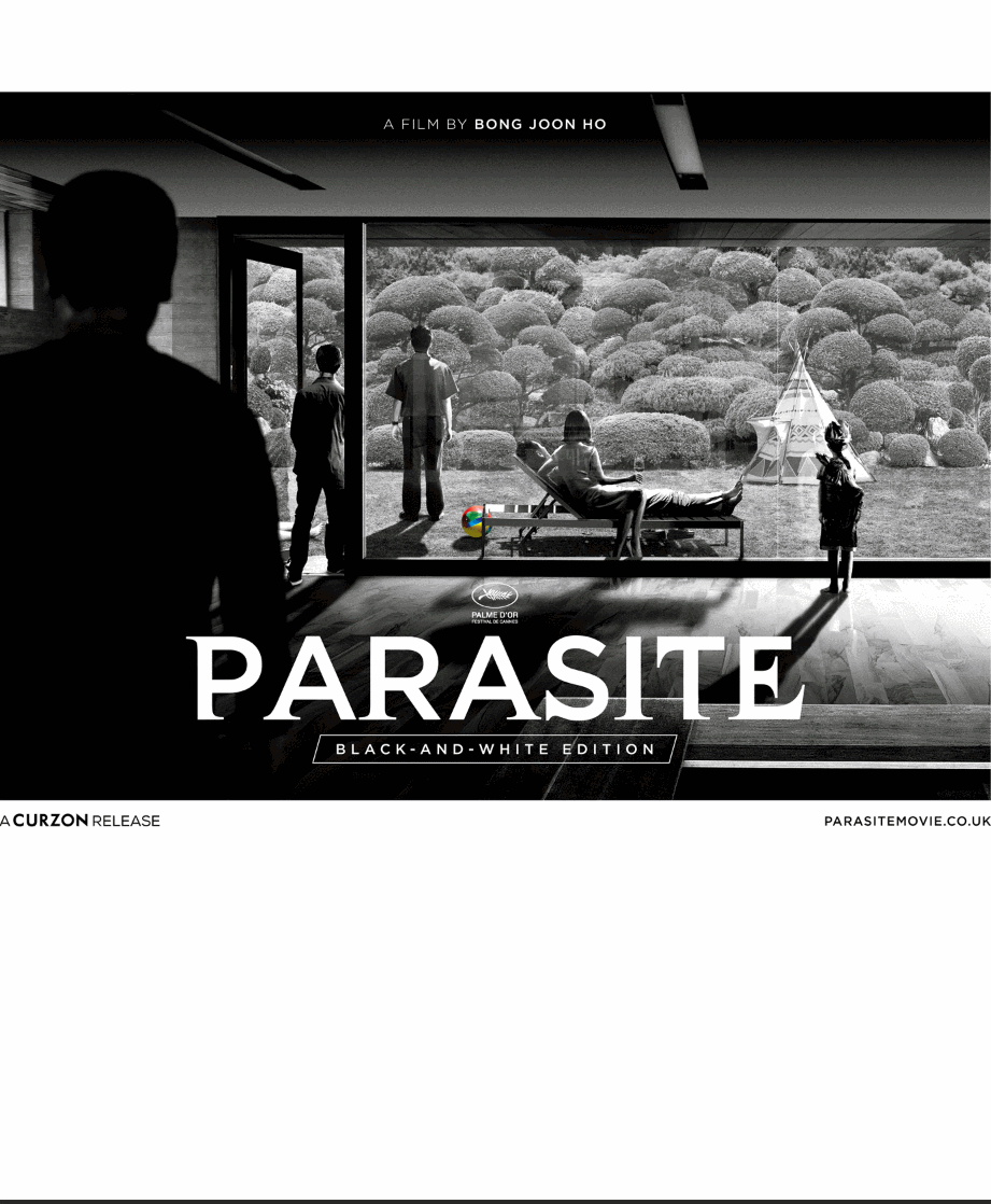
Parasite (4K+2D Blu-ray SteelBook) [UK]
- Thread starter Noodles
- Start date
You are using an out of date browser. It may not display this or other websites correctly.
You should upgrade or use an alternative browser.
You should upgrade or use an alternative browser.


Tbh I don't really like it.. Something seems off. Can't put my finger on it but I don't like the composition I think.. Much prefer the criterion digipack and the red and blue steelbook.

Also now available at Zoom:
 www.zoom.co.uk
Parasite: Black and White Edition (4K Ultra HD + Blu-ray (Limited Edition Steelbook)) [Blu-ray]
Buy Parasite: Black and White Edition on Blu-ray with FREE delivery from ZOOM.co.uk - See our full range of other Blu-ray titles.
www.zoom.co.uk
Interesting cover, kinda like the idea of reversing the theatrical poster from the other perspective
(there's a slow and fast version of this gif in this imgur album)
Potentially the extension of the wooden tiles at the bottom and only stretching out the shadow from the lounger compared to the other shadows has messed with the perspective a little? Flipping between does make it feel less 'off' to me now though!
The taller version does allow it to include the stairway lights, but also stops the silhouette of the man from framing the composition as well - Interested to hear if anyone else has different thoughts
This is all still TBC anyways so some or all of this could completely change anyways
Something felt a little off to me too and I couldn't quite put my finger on it, I thought they'd maybe squished the image but wouldn't believe that so I dropped the original poster and cover into photoshop for a comparisonTbh I don't really like it.. Something seems off. Can't put my finger on it but I don't like the composition I think.. Much prefer the criterion digipack and the red and blue steelbook.
(there's a slow and fast version of this gif in this imgur album)
Potentially the extension of the wooden tiles at the bottom and only stretching out the shadow from the lounger compared to the other shadows has messed with the perspective a little? Flipping between does make it feel less 'off' to me now though!
The taller version does allow it to include the stairway lights, but also stops the silhouette of the man from framing the composition as well - Interested to hear if anyone else has different thoughts
This is all still TBC anyways so some or all of this could completely change anyways
Thanks for that. Prefer the original wider poster a lot more.Interesting cover, kinda like the idea of reversing the theatrical poster from the other perspective
Something felt a little off to me too and I couldn't quite put my finger on it, I thought they'd maybe squished the image but wouldn't believe that so I dropped the original poster and cover into photoshop for a comparison
(there's a slow and fast version of this gif in this imgur album)
Potentially the extension of the wooden tiles at the bottom and only stretching out the shadow from the lounger compared to the other shadows has messed with the perspective a little? Flipping between does make it feel less 'off' to me now though!
The taller version does allow it to include the stairway lights, but also stops the silhouette of the man from framing the composition as well - Interested to hear if anyone else has different thoughts
This is all still TBC anyways so some or all of this could completely change anyways
I've pre-ordered this, but really, really wish Plain will do a version similar to The Handmaiden.
Artwork updated at Amazon and sold out at Zavvi


Wait what, where did everyone go..... oh it's the back (with a body)
Beach ball has moved too! Shady
I really like the art
And the light is ON alsoBeach ball has moved too! Shady
I really like the art
Beach ball has moved too! Shady
I really like the art
Are they all down the launderette or in the wigwam? I was always told to keep the light on when out - deters from robbersAnd the light is ON also

I think it's great - I really like the art too!
Haha that's great!
We've had a view to the house
 + a view inside the house
 so I guess it's about time we had a view from the house

Looks pretty neat too.
The actual living room of the set with spectacular picture window which could best be described as a wall of glass:-

Looks pretty neat too.
The actual living room of the set with spectacular picture window which could best be described as a wall of glass:-
Love the artwork.
Do i need a 5th version of parasite?
Yes. Yes i do
Do i need a 5th version of parasite?
Yes. Yes i do
Zavvi is available to pre order

Similar threads
- Replies
- 2
- Views
- 371
- Replies
- 0
- Views
- 339
- Replies
- 14
- Views
- 2K
- Replies
- 19
- Views
- 2K