Schindler's List (Possible Blu-ray SteelBook) (Manta Lab Exclusive No.?) [Hong Kong]

Would you purchase this steelbook?


  • Total voters
    136

Aniv

Premium Supporter
Jan 6, 2015
3,110
Release date: TBA
Purchase link: TBA
Price: TBA

SchindlersList-banner.jpg


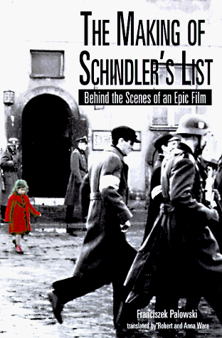
This movie is very close to my heart and I had been waiting for an exclusive premium editions since forever.

What do you guys think about this title? Maybe 2 editions.

The HDN Groupbuy if it happens will have exclusive extras.

As a bonus I will be hosting a contest for the best steelbook design. Template that can be used https://www.hidefninja.com/communit...teelbook-art-photoshop-templates-tutorial.11/ or feel free to use any template you like.

Let's give @Noodles something to think about.

A free copy #111 will be provided to the winning design if its selected for use. Must use approved art work (no fan art) and use HDN steelbook design template.
 
Last edited by a moderator:
Was going to give this another go since I have some free time today, but I see CineMaterial have been asked by "the copyright owner" to remove all posters for this film from their site... they were there the other day, so it seems like a bit of an odd coincidence that they'd ask for them to be removed now. :cautious:
 
Was going to give this another go since I have some free time today, but I see CineMaterial have been asked by "the copyright owner" to remove all posters for this film from their site... they were there the other day, so it seems like a bit of an odd coincidence that they'd ask for them to be removed now. :cautious:

Was there much available on that site?
 
Was going to give this another go since I have some free time today, but I see CineMaterial have been asked by "the copyright owner" to remove all posters for this film from their site... they were there the other day, so it seems like a bit of an odd coincidence that they'd ask for them to be removed now. :cautious:

was thinking about that if new 4k release out in october is it possible that they are doing all new official artwork to shift it?
and maybe why pulled old artwork as a possabilty?
just a thought, what you think?

basil :thumbs:
 
Was there much available on that site?
Nothing different to what is available elsewhere, but it just made it easier to have everything in one place.

was thinking about that if new 4k release out in october is it possible that they are doing all new official artwork to shift it?
and maybe why pulled old artwork as a possabilty?
just a thought, what you think?

basil :thumbs:
New artwork would be very welcome! Might be worth Manta holding off on this release until then if that's the case. I can't see why that would be the reason for the studio to demand removal of everything on CM though... they had all the posters uploaded for a while (I actually thought about doing a steelbook concept long ago, so checked CM to see what was available at the time).
 
  • Thanks
Reactions: Basil
FilmArena.cz posted a while ago on facebook a mention of Schindler's List steelbook might be happening

I would take a guess a steelbook release will be happening in various countries considering it's a Universal release

Be interesting to see what differences will be between Manta and a trade wide release in other countries if both releases happen
 
So I've gotten a little carried away, so I hope you guys are ready for quite a few images. I will thumbnail them so the post isn't MASSIVE.

So first of all, I have my revised original concept taking on board some thoughts from people here on the title and rear treatment. Version 3 uses a typewriter style font, while I left Version 2 plain but with a slight increase of visability of the typewriter image itself.

SchindlersList-V2.png----------SchindlersList-V3.png

Next I have some further rear art treatments. I'm happy with my choice for cover and spine arts, so I've been trying different movie scenes, including an image that seemed to come from a marketing poster that had a collection of discarded photographs. Various sections of these designs, and the previous could be picked out for glossing and bossing. The metal bar on the typewriter for instance, or maybe a select photograph in V4. Obviously, the title will get the boss treatment.

SchindlersList-V4.png----------SchindlersList-V5.png----------SchindlersList-V6.png----------SchindlersList-V7.png

and finally, the following image is my idea for a slipcover. Unfortunately, I don't have a template for a slipcover so I have put the design on the steelbook template to give everyone the idea that I was going for. This is using images of the historical lists that I managed to find. Despite this being a film, these were real people and I wanted to give them some sort of recognition and what better way than to show some of the names on the outer slip, the first thing that owners of this set would see. Title treatment on the slip would be bossed too.

SchindlersList-SlipcoverIdea.png

I've had a few people say that they like my original idea with the red on the title. Of course, if that got more support any of these concepts could get the same treatment.
That's all for this post. Hope people are fans.
 
Version 2 or Version 7. Nice work! :)

I'd actually like a lenticular of the image on the back of Version 7, so maybe this version as double lenti slip, and then the sepia concept I did for the steelbook? Some combination like that would be very cool for me. Not as big a fan of just the list as a slipbox.
 
Last edited:
So I've gotten a little carried away, so I hope you guys are ready for quite a few images. I will thumbnail them so the post isn't MASSIVE.

So first of all, I have my revised original concept taking on board some thoughts from people here on the title and rear treatment. Version 3 uses a typewriter style font, while I left Version 2 plain but with a slight increase of visability of the typewriter image itself.

View attachment 389193----------View attachment 389194

Next I have some further rear art treatments. I'm happy with my choice for cover and spine arts, so I've been trying different movie scenes, including an image that seemed to come from a marketing poster that had a collection of discarded photographs. Various sections of these designs, and the previous could be picked out for glossing and bossing. The metal bar on the typewriter for instance, or maybe a select photograph in V4. Obviously, the title will get the boss treatment.

View attachment 389195----------View attachment 389196----------View attachment 389197----------View attachment 389198

and finally, the following image is my idea for a slipcover. Unfortunately, I don't have a template for a slipcover so I have put the design on the steelbook template to give everyone the idea that I was going for. This is using images of the historical lists that I managed to find. Despite this being a film, these were real people and I wanted to give them some sort of recognition and what better way than to show some of the names on the outer slip, the first thing that owners of this set would see. Title treatment on the slip would be bossed too.

View attachment 389192

I've had a few people say that they like my original idea with the red on the title. Of course, if that got more support any of these concepts could get the same treatment.
That's all for this post. Hope people are fans.
Great work. I really like the idea of a slip with the actual list, and one criticism, I don't like the typewriter font for the text, it clashes with the very classy font used for the cover and spine. Best bet IMO is to use Hebrew for the quote or leave it out.
 
I took his comment more for meaning .... its not an old movie where tech wasnt available .... it was purposely put in black and white and he would have preferred color.

I dont mind it in black and white ... but it would kind of been cool to have an alternate version in color and the red scene adverse in black in white on her. But its the man him self, spielberg he has a vision and he's a master at his craft so he obviously wouldnt be making 5 cuts and instead stick to his art.

never the less no reason to boycott the film he donated all earnings to a great cause!

I can’t imagine anyone telling Picasso that other artists managed to make art in other styles.
 
Great work. I really like the idea of a slip with the actual list, and one criticism, I don't like the typewriter font for the text, it clashes with the very classy font used for the cover and spine. Best bet IMO is to use Hebrew for the quote or leave it out.

I totally agree, but it was suggested so I thought I’d try it. Personally I hate it with the typewriter font, and that version is my least favourite.
 
  • Thanks
Reactions: DMD4k
@TheJoker Looking good (again). Version 4 is my favorite. Definitely a no-no for the typewriter font on Version 3. I also like Versions 6 and 7 but I don't like the fact that the back images are black and white while the front has more color. Maybe sepia effect on the back would let them match more.
 
@TheJoker Looking good (again). Version 4 is my favorite. Definitely a no-no for the typewriter font on Version 3. I also like Versions 6 and 7 but I don't like the fact that the back images are black and white while the front has more color. Maybe sepia effect on the back would let them match more.

Thanks for the feedback. It’s definitely something I can try out next time I’m on the computer. To be honest, once I’d done the 7th concept and then finished the slipcover idea my eyes were starting to hurt. I’ll try out the sepia on the rear art next time, I already played a little bit with it for the slipcover idea.
Version 3 I’m going to consign to the scrap heap I think. :LOL:
 
  • Like
Reactions: IRON MAN
Thanks for the feedback. It’s definitely something I can try out next time I’m on the computer. To be honest, once I’d done the 7th concept and then finished the slipcover idea my eyes were starting to hurt. I’ll try out the sepia on the rear art next time, I already played a little bit with it for the slipcover idea.
Version 3 I’m going to consign to the scrap heap I think. :LOL:

Understandable. :)

Cool, looking forward to seeing how it comes out.

Version 3, yes, do that. ;)
 
  • Haha
Reactions: TheJoker
I really like versions 2, 6, and 7 but instead of the list all over the slip I'd prefer the back art of version 6 or 7 as the slip (but with the title overlaid somewhere). Sorry if that sounds confusing ;).
 
So I've gotten a little carried away, so I hope you guys are ready for quite a few images. I will thumbnail them so the post isn't MASSIVE.

So first of all, I have my revised original concept taking on board some thoughts from people here on the title and rear treatment. Version 3 uses a typewriter style font, while I left Version 2 plain but with a slight increase of visability of the typewriter image itself.

View attachment 389193----------View attachment 389194

Next I have some further rear art treatments. I'm happy with my choice for cover and spine arts, so I've been trying different movie scenes, including an image that seemed to come from a marketing poster that had a collection of discarded photographs. Various sections of these designs, and the previous could be picked out for glossing and bossing. The metal bar on the typewriter for instance, or maybe a select photograph in V4. Obviously, the title will get the boss treatment.

View attachment 389195----------View attachment 389196----------View attachment 389197----------View attachment 389198

and finally, the following image is my idea for a slipcover. Unfortunately, I don't have a template for a slipcover so I have put the design on the steelbook template to give everyone the idea that I was going for. This is using images of the historical lists that I managed to find. Despite this being a film, these were real people and I wanted to give them some sort of recognition and what better way than to show some of the names on the outer slip, the first thing that owners of this set would see. Title treatment on the slip would be bossed too.

View attachment 389192

I've had a few people say that they like my original idea with the red on the title. Of course, if that got more support any of these concepts could get the same treatment.
That's all for this post. Hope people are fans.

Liking 2, 4, 6 and 7
 
@Aniv with regards offical artworks can ones from book releases such as below be used?

im presuming it is an offical artwork of such just used on a books or are these not regarded offical enough?
just trying to see if can help expand artwork

61MeTlsDRtL.jpg

717NWPSCCTL.gif


basil :thumbs:

Great question. Let me find out which arts are "official" as per the studio and I will get back. There is no limit fo entries per member.
 
  • Helpful Post
  • Thanks
Reactions: Basil and Noodles
Great question. Let me find out which arts are "official" as per the studio and I will get back. There is no limit fo entries per member.
Any chance Manta or the studio could provide us with whatever artwork/images they have available to them? It would make this so much easier! It'd also be helpful if they could maybe share the proper steelbook template they use, so the winner won't have to recreate their artwork - I had to do that once for a FilmArena project and ran into so many problems trying to recreate it because my custom template was so much different/smaller to the one they actually use.
 
  • Thanks
Reactions: Aniv