

Last edited by a moderator:
The Incredibles 2 (3D+2D Blu-ray SteelBook) (Zavvi Exclusive) [UK]
- Thread starter snooloui
- Start date
You are using an out of date browser. It may not display this or other websites correctly.
You should upgrade or use an alternative browser.
You should upgrade or use an alternative browser.


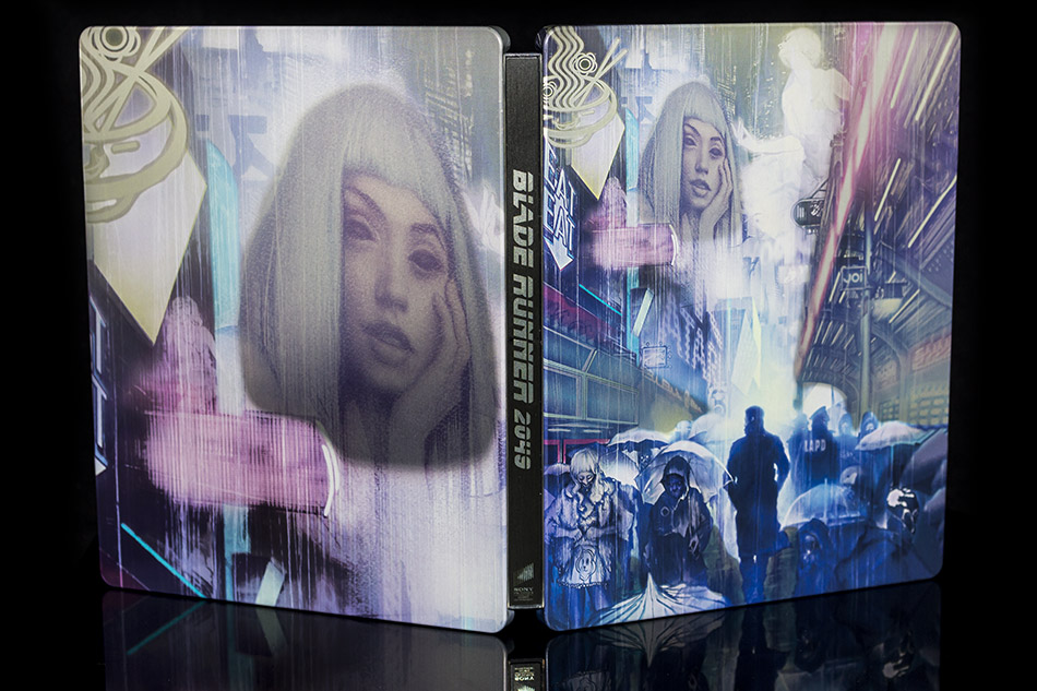
Ahhh, thanks. I'd only looked at the first picture.She's hanging off the bottom, it's just that the J Card in the main picture covers her up , check the 2nd image
")
It's a good thing artistic preferences aren't, like, subjective or anything.Never understood this obsession with "matching" artwork.
What good is that if the artwork is shite.
Who wants a matching collection of shite.

Well, someone mentioning poop reminded me of this (in)famous modern example …

… although the more regular **** collectors go for fossilised excrement known as coprolite … w/ the world record held - as of November, 2016 - by this gent from the US with 1,277 pieces in his 'poosium' … not forgetting Ozzy Osbourne with the replica T-Rex poop :-
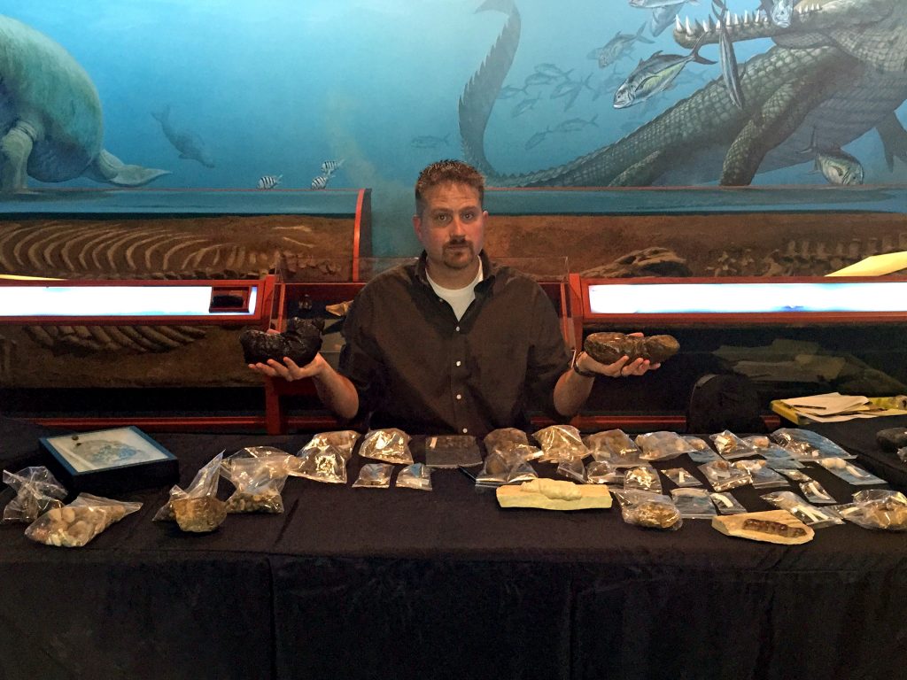

… although the more regular **** collectors go for fossilised excrement known as coprolite … w/ the world record held - as of November, 2016 - by this gent from the US with 1,277 pieces in his 'poosium' … not forgetting Ozzy Osbourne with the replica T-Rex poop :-
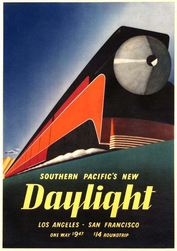
I guess the choice is either a washing machine or a bunch of two-tone polygons?
I guess if you want the movie ASAP, this looks slightly better..
I guess if you want the movie ASAP, this looks slightly better..
D
Deleted member 29108
Pre order cancelled. This final art not doing it for me at all. I’ll hedge my bets on a decent Korean release.
Don't think so … also don't think we've had the back art reveal of the US 'washing machine' steelbook either.Am I right in stating the back/inside artwork hasn't been revealed yet?
Maybe still working on it … this Dolby Cinemas poster is quite different to most of the regular INCREDIBLES 2 posters … maybe ending up w/just the logo or one of the characters 'in big.
Personally, as she's not on the front, I'd put Edna on the back complete with quote (after changing the background colour to better match either of the two sandy colours of the front).
Unlikely to be chosen as interior art but this explosion of colour contrasting with the quite basic black, orange and sandy colours of the exterior would be fun:-
As for those customers with deep pockets and the desire for a region free fully loaded steelbook there's always you know who - the US seller happy to oblige for $79 + $24 P&P over on the bay w/ "14 sold " and "more than 10 available" (item location Houston, Texas).

You know you are done with these new releases for Disney/Marvel/Pixar films when you feel numb and remember you don't even pre order now because you expect to be disappointed
Sigh
Blufans it is...hopefully now I can start collecting more with a better income.
Sigh
Blufans it is...hopefully now I can start collecting more with a better income.
This has become a really fun thread.
I genuinely believe that if the black parts of this cover are embossed and gloss, and the background makes use of some metallic sheen, this'll be a beautiful steelbook. If none of that is true, then I'll still like the art better than the washing machine, but the steelbook itself won't be particularly special.
I genuinely believe that if the black parts of this cover are embossed and gloss, and the background makes use of some metallic sheen, this'll be a beautiful steelbook. If none of that is true, then I'll still like the art better than the washing machine, but the steelbook itself won't be particularly special.
You can make a boring jpeg into a great steelbook, though. The BB Incredibles steel this year looked (to me) terrible and pointless in the previews. And then I saw it in person, and it's one of my favorite steels in my collection. Beautifully realized because of gloss and debossing.
Same thing with the most recent Psycho steelbook, which didn't interest me at all in the preview images, but the thing itself is quite good.
Same thing with the most recent Psycho steelbook, which didn't interest me at all in the preview images, but the thing itself is quite good.
Futureshop viva piece of artI'd argue that, if you're talking about the Best Buy 4K steelbook, there is an illusion of depth to that artwork. This one is flat, even the colour isn't used effectively. But then, I still like the Futureshop Viva.
This steelbook piece of sh*t
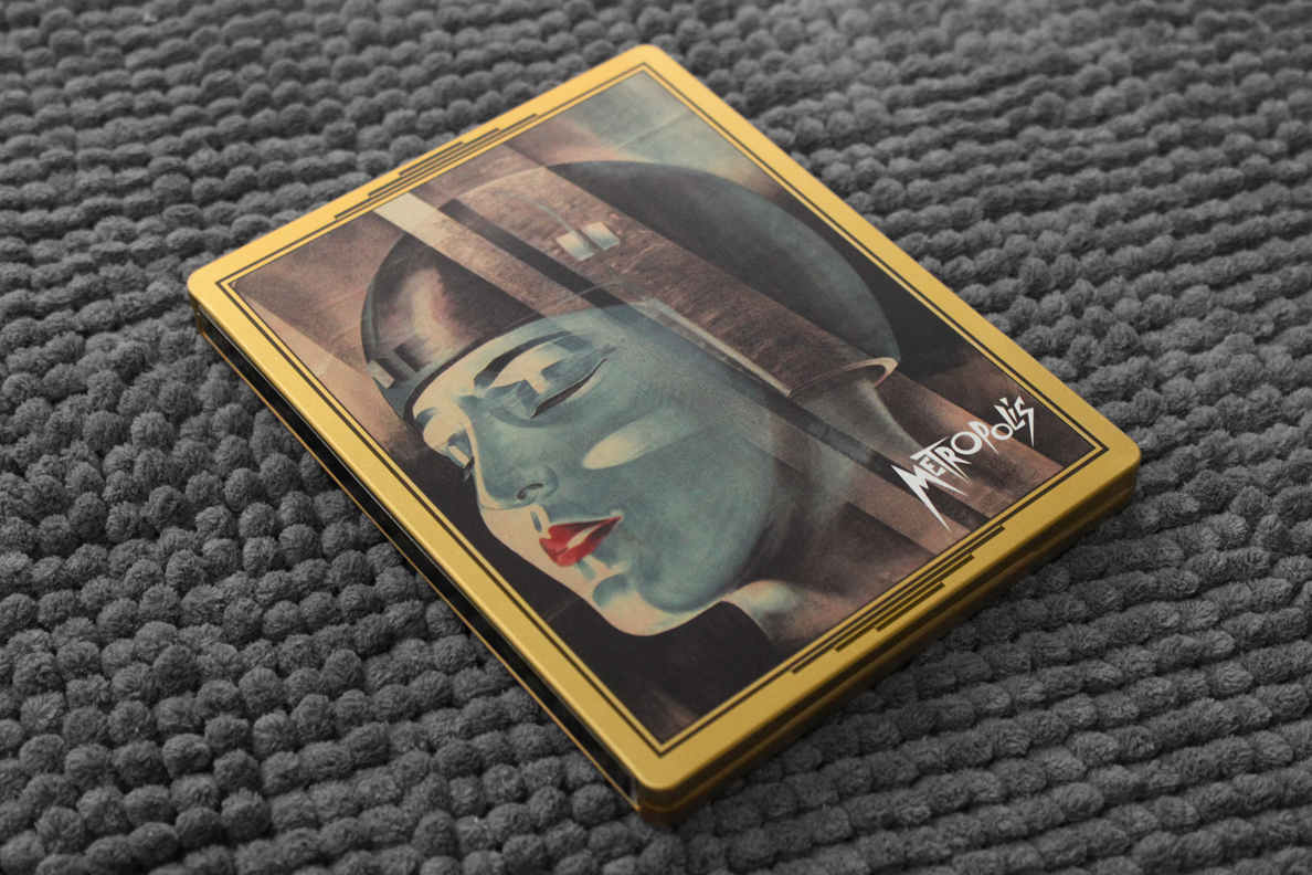
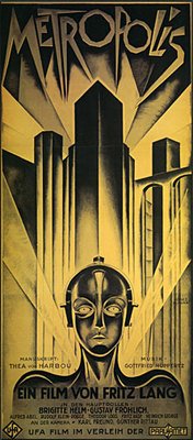
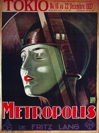
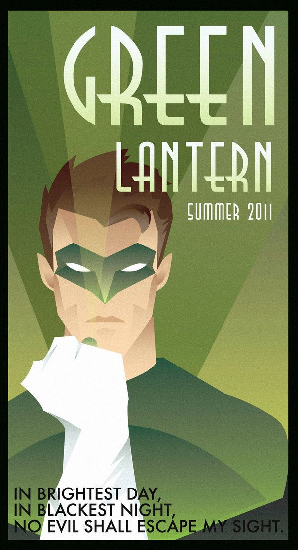
I really hate that Art Deco style. It always conjures up images of nazi Germany in my mind.
I see where you're coming from . . . with certain infamous images of the time. I personally don't allow that historical aberration to spoil my appreciation of the stunning designs
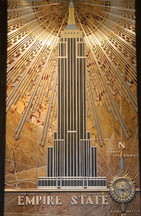
produced for advertising movies, consumer products, travel, cigarettes/cigars, alcohol and everything in between . . . personally a big fan of all things Art Deco - from architecture, posters, Clarice Cliff 'Bizarre' range pottery etc. . . . sort of in the same way that I don't allow today's nazis to spoil my enjoyment of steelbooks.
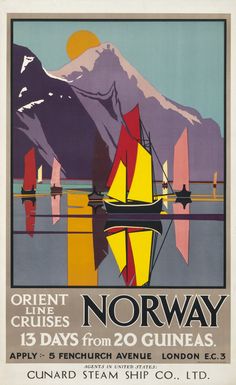
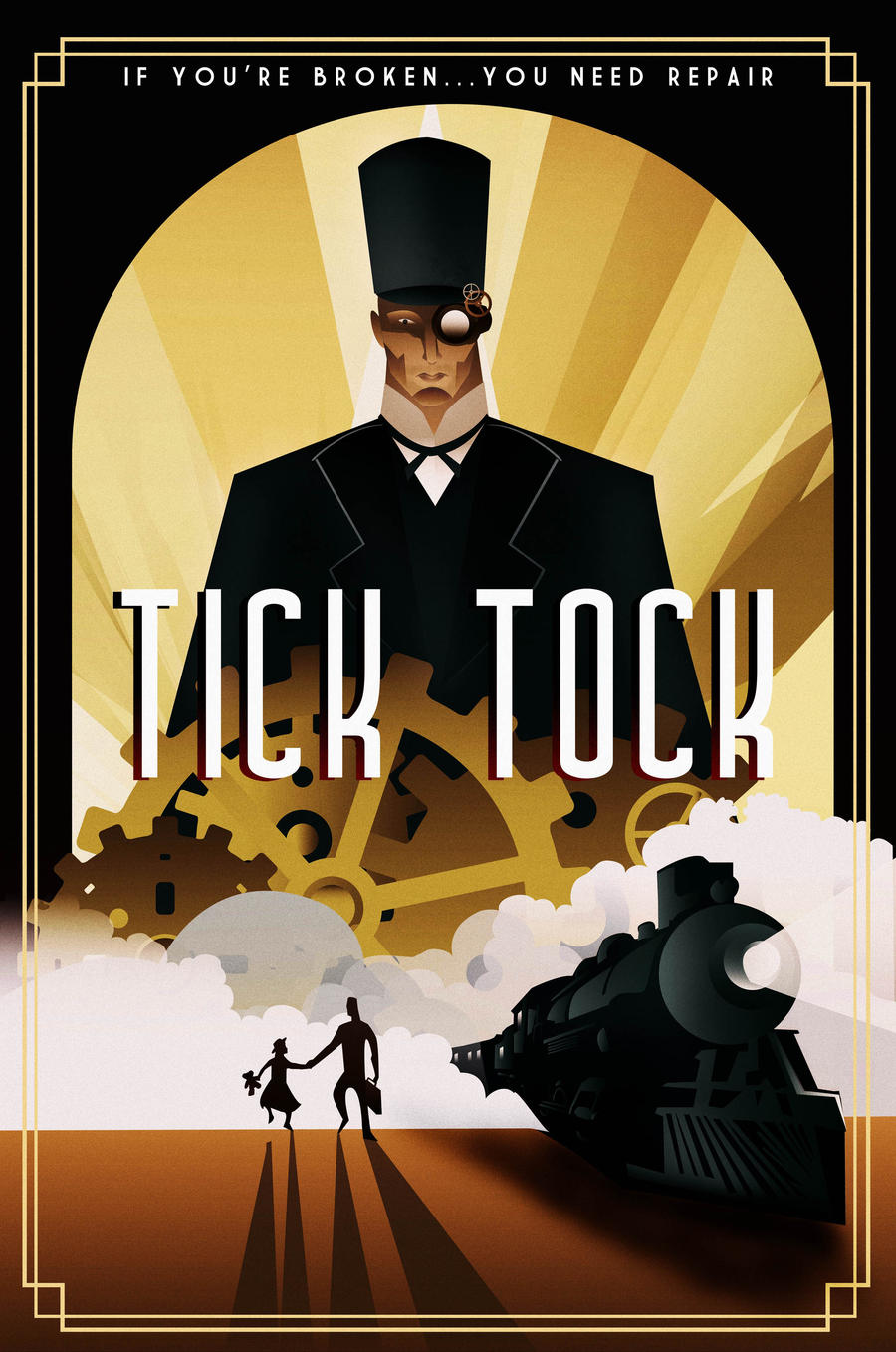
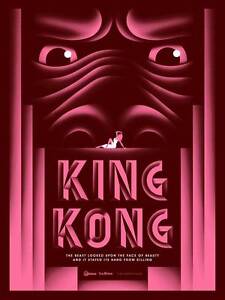
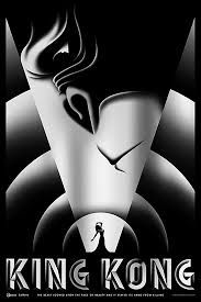
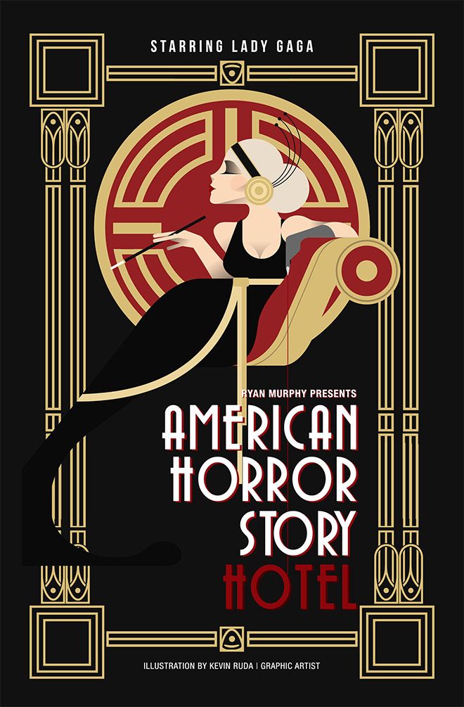
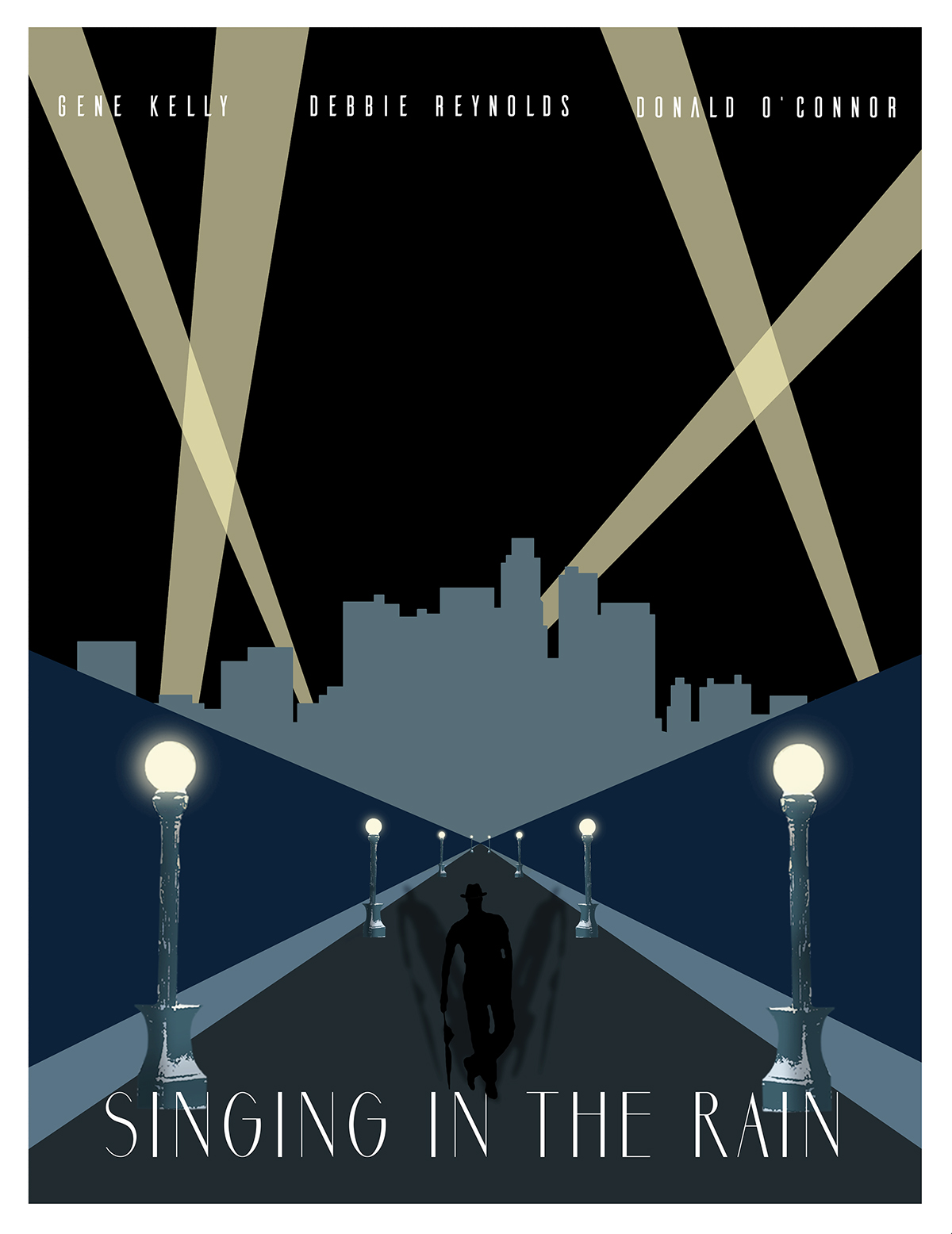
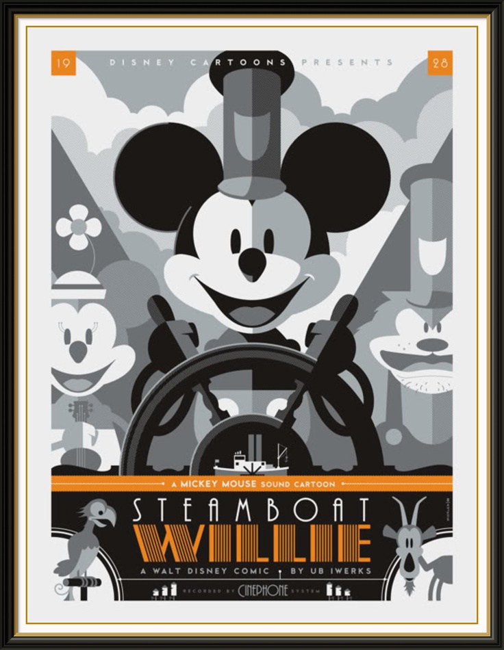
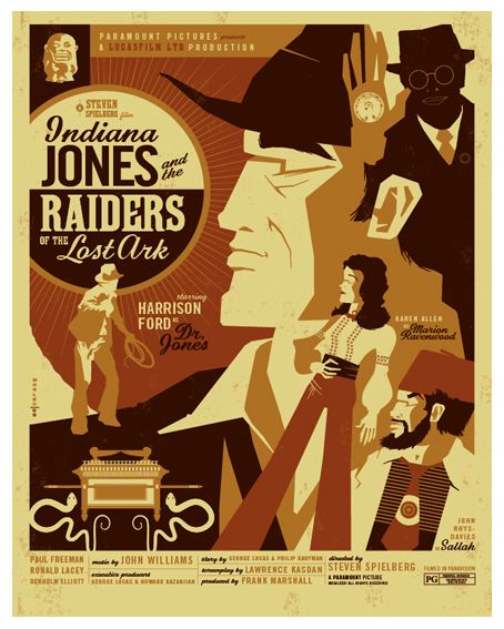
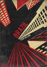
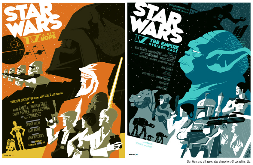
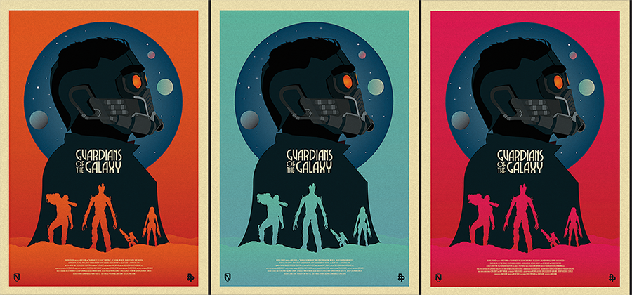
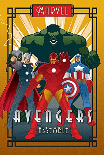
Love those cool, symmetrical, geometric, streamlined and elegant Art Deco POSTERS and I welcome the new fresh 1920s - '40s style after the fussy, swirly 1890s - 1920 Art Nouveau style . . .

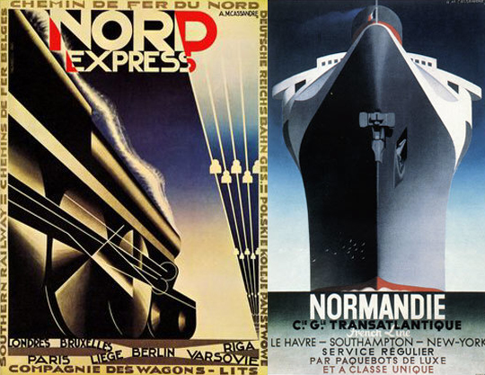


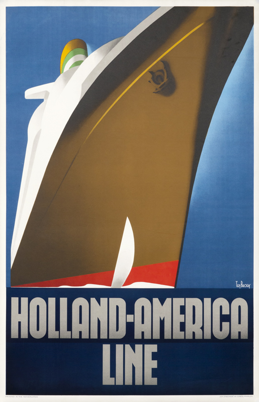
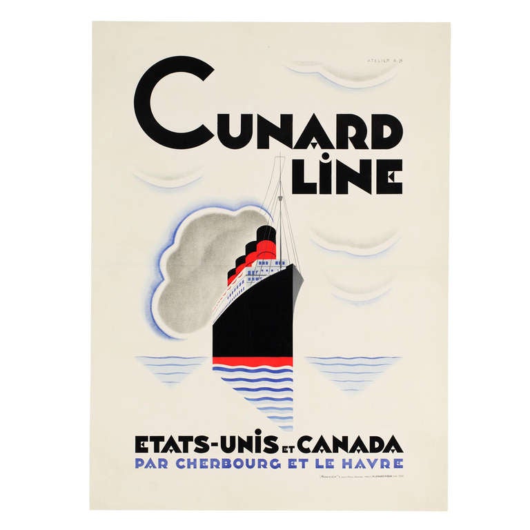


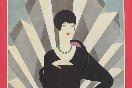


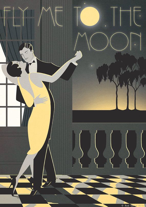

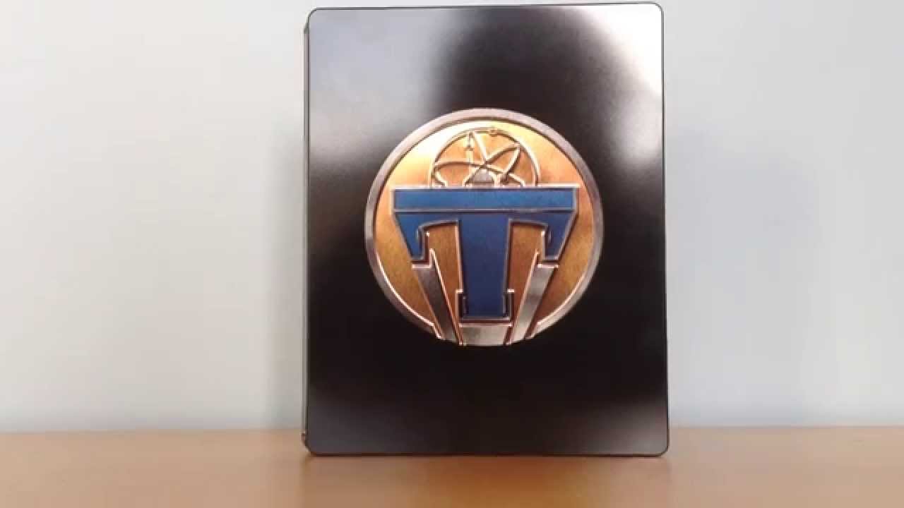
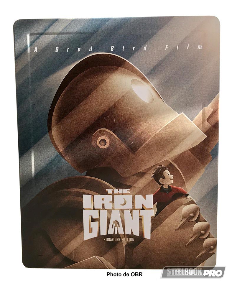
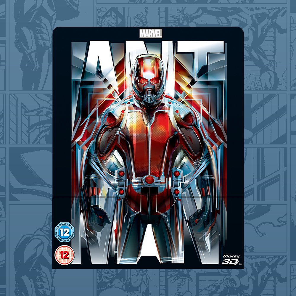
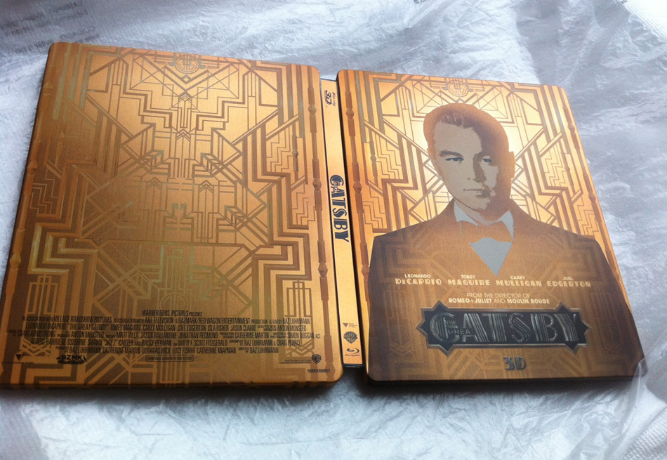
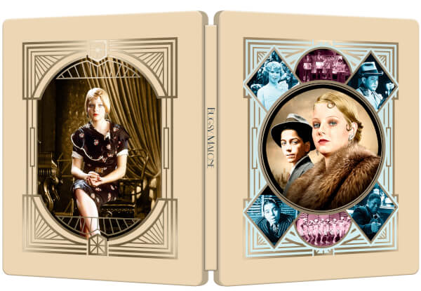
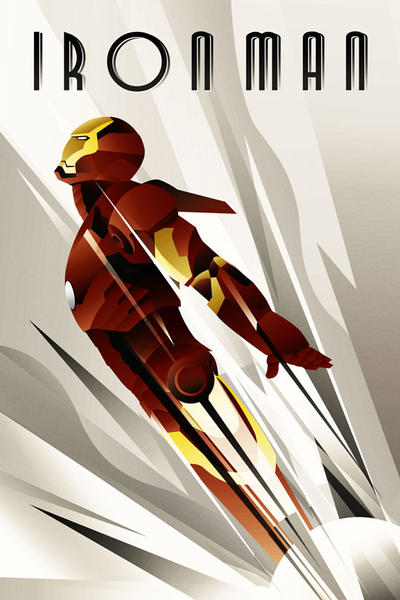
. . . and Art Deco inspired STEELBOOKS:-


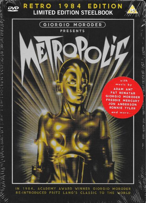
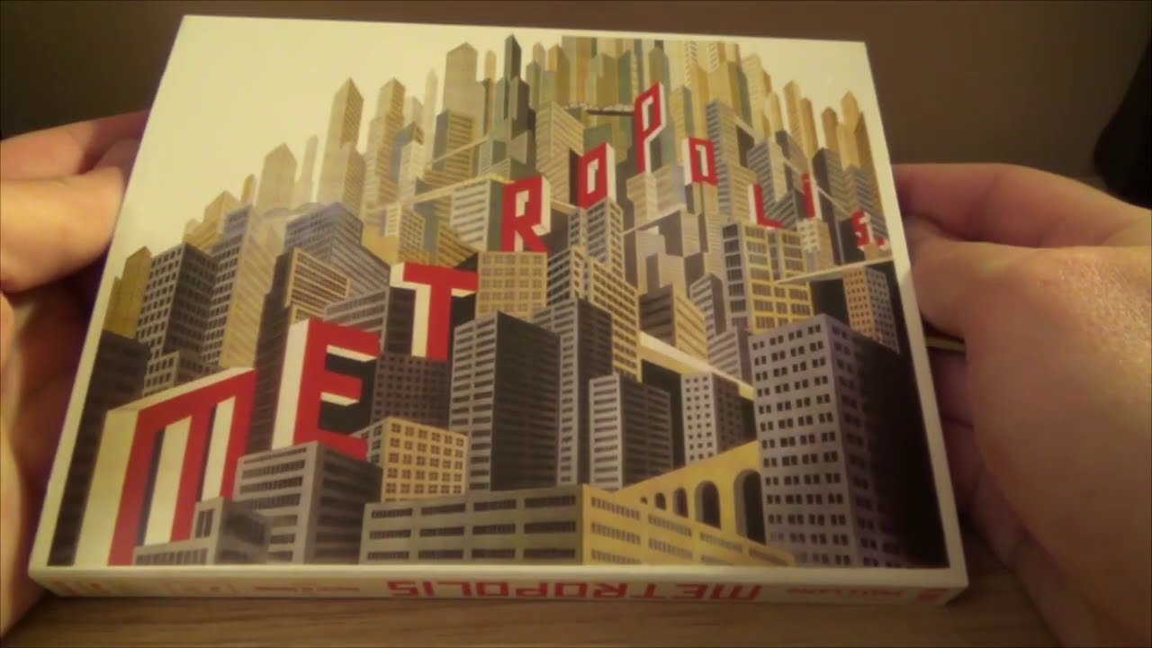


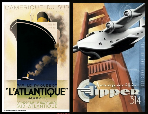
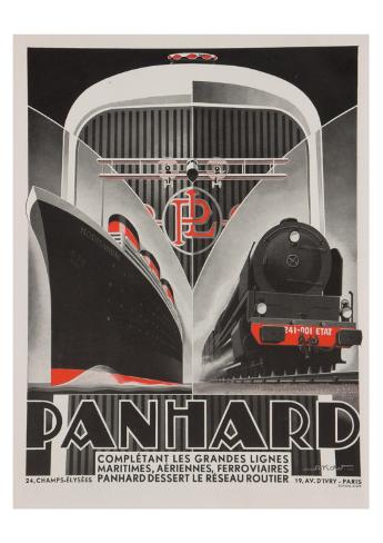
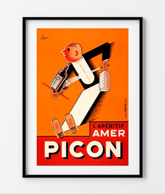
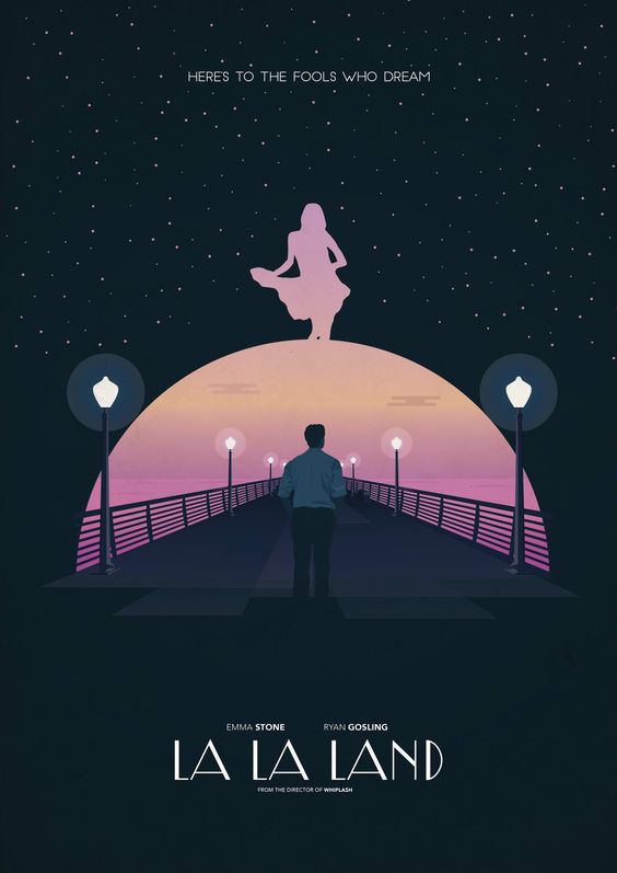
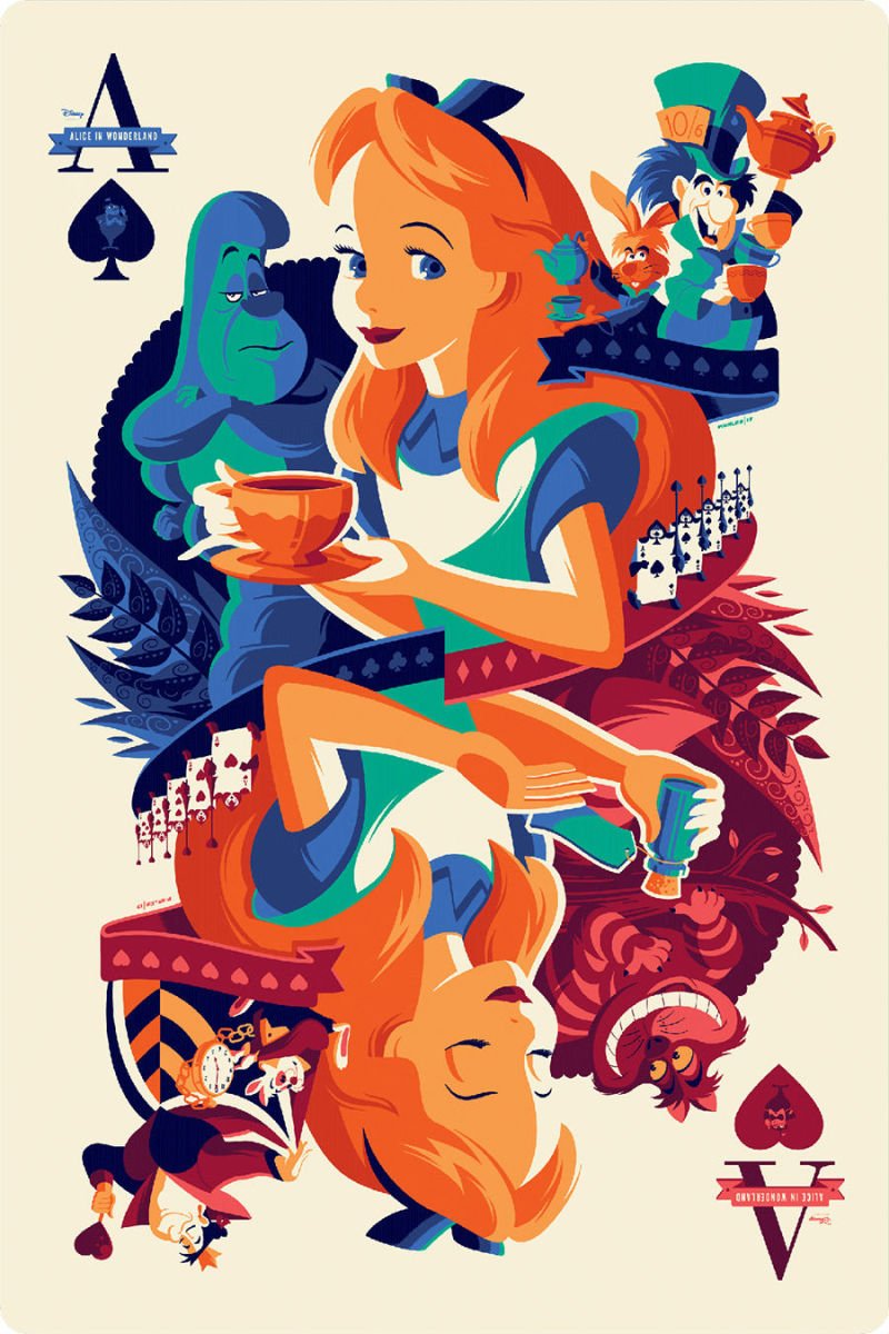
. . . and even Art Deco style FILM POSTERS:-


Last edited:
Similar threads
- Replies
- 10
- Views
- 1K
- Replies
- 9
- Views
- 2K
- Replies
- 16
- Views
- 2K
- Replies
- 2
- Views
- 526