Last edited by a moderator:
Deadpool 2 (4K+2D Blu-ray SteelBook) (HMV Exclusive) [UK]
- Thread starter Norwichlad
- Start date
You are using an out of date browser. It may not display this or other websites correctly.
You should upgrade or use an alternative browser.
You should upgrade or use an alternative browser.


Are the U.K. getting the uncut version on blu ray like the US?
I heard the director had a uncut version but that the plan was to release it separately down the line so I’m happy they have decided to release it straight away.
Edit: just noticed the HMV tweet says super version so I assume that means uncut. Hopefully it’s with all versions instead of limited to the steelbook. Can’t believe how shocking it is and how amazing the FA version is
This makes Star Wars The Force Awakens steelbook look a masterpiece. Who at these film studios are authorising crap like this???
I’ll go for this just because the spine will match the first one (roughly)
I actually like the Target Exclusive a lot but it won’t match so problem solved in a way.
I actually like the Target Exclusive a lot but it won’t match so problem solved in a way.

IMO this steel is ugly and lazy! I think I'll be happy enough with a cool slipcover!
Also I don't appreciate that fact HMV appear to be upping their 4k steels to £30!! They are obviously clicking on to the fact that the £25 point price was bob on! Appears that the shape of water is the last 4k steel at £25!
Also I don't appreciate that fact HMV appear to be upping their 4k steels to £30!! They are obviously clicking on to the fact that the £25 point price was bob on! Appears that the shape of water is the last 4k steel at £25!

IMO this steel is ugly and lazy!
How on earth is this lazy ? seriously.
completely understand why you may think this artwork is ugly. & that's a perfectly legitimate complaint. But Lazy ???
this is in no way lazy, infact of the film steelbooks released this year this is one of the least "Lazy" If you want to talk about lazy, look at most steelbooks that are released, I'd argue slapping the most obvious poster art on the front and back is as lazy as steelbook design gets.
in my mind if you type in a films name & the word poster, you shouldn't be allowed to use those images as a steelbook design. they should always be more creative.
You may not like the style, but at least They've tried to be creative. Using the art style featured within the films credits is a pretty smart idea. You might not like it but it's actually kinda clever. They've created a steelbook that is supposed to look like deadpool himself designed it. & this is 100% what it'd look like if he did.
Funny because the Deadpool 2 FilmArena Steelbook which uses the IMAX poster as it's cover art is f***** amazing.
I actually think this suits the movie AND the character Deadpool perfectly.
It’s not the prettiest but it’s no worse than the ‘ouchie’ lenti magnet used on the first one.
Plus, sticking with the black red and white scheme looks good.
I’m edging for the FAC lemti slip to go with the first, if I can, but would gladly have this otherwise(cant recall if i preordered yet...)
Basically, I like it. Not stunning, but it’s differant, minimal compared to the busier FAC WEA and suits.
in my mind if you type in a films name & the word poster, you shouldn't be allowed to use those images as a steelbook design. they should always be more creative.
Wow I have seen some absolute nonsense on this forum over the years, but that really takes things to a whole new level!
Why are some people obsessed with steelbooks being "creative"? I don't want that experimental crap on my steelbook, just give me the damn poster art. Honestly, if had the power to do so I'd make it MANDATORY that the first steelbook release of any film MUST feature the official poster art. After that you can do whatever the hell you want with crazy far-out designs, but the art that was designed to please the most people should be the one available first IMHO.
How Is it nonsense?
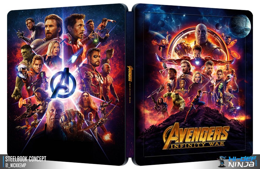
Reusing artwork is lazy and cheap, and many times looks too busy and not good having a large, full poster, shrunk to steelbook size. Imagine Infinity War character poster squished down to size...it would be cramped and horrid.
Everyone is entitled to their opinion, but there is no need to be negative or insult another member said opinions - all are welcome and valid here.
You clearly disagree, and that’s ok.
Luckily we often see many versions of steelbooks, or slips, so you have a high chance of getting what you want with poster art being used a tad least once, somewhere.
It shouldn’t mean differant artwork should be disallowed. The more variations of artwork the better in my opinion, then most people can find one for their taste,
THAT said, I would love the chair/raining bullet poster image used for the steelbook if any poster.
There's nothing worse for me than a steelbook using the same artwork as the amaray, that's why I don't tend to like poster art being used. No reason to buy a steelbook when the same art is available cheaper IMO, I started buying steelbooks because they offered something different.Wow I have seen some absolute nonsense on this forum over the years, but that really takes things to a whole new level!
Why are some people obsessed with steelbooks being "creative"? I don't want that experimental crap on my steelbook, just give me the damn poster art. Honestly, if had the power to do so I'd make it MANDATORY that the first steelbook release of any film MUST feature the official poster art. After that you can do whatever the hell you want with crazy far-out designs, but the art that was designed to please the most people should be the one available first IMHO.
How on earth is this lazy ? seriously.
completely understand why you may think this artwork is ugly. & that's a perfectly legitimate complaint. But Lazy ???
this is in no way lazy, infact of the film steelbooks released this year this is one of the least "Lazy" If you want to talk about lazy, look at most steelbooks that are released, I'd argue slapping the most obvious poster art on the front and back is as lazy as steelbook design gets.
in my mind if you type in a films name & the word poster, you shouldn't be allowed to use those images as a steelbook design. they should always be more creative.
You may not like the style, but at least They've tried to be creative. Using the art style featured within the films credits is a pretty smart idea. You might not like it but it's actually kinda clever. They've created a steelbook that is supposed to look like deadpool himself designed it. & this is 100% what it'd look like if he did.
Sorry dude didnt mean to offend anyone maybe lazy was the wrong word but it could have been so so much better
How Is it nonsense?
Reusing artwork is lazy and cheap, and many times looks too busy and not good having a large, full poster, shrunk to steelbook size. Imagine Infinity War character poster squished down to size...it would be cramped and horrid.
Everyone is entitled to their opinion, but there is no need to be negative or insult another member said opinions - all are welcome and valid here.
You clearly disagree, and that’s ok.
Luckily we often see many versions of steelbooks, or slips, so you have a high chance of getting what you want with poster art being used a tad least once, somewhere.
It shouldn’t mean differant artwork should be disallowed. The more variations of artwork the better in my opinion, then most people can find one for their taste,
THAT said, I would love the chair/raining bullet poster image used for the steelbook if any poster.
Urm...
As @Noodles has shown us it's anything but horrid, light years ahead of the World Wide release version and the same is with Deadpool and the IMAX poster.
Poster art can work when done correctly, if you don't do it right when you easily can then at the end of the day it kind of is lazy as you aren't putting the effort into it.
There's nothing worse for me than a steelbook using the same artwork as the amaray, that's why I don't tend to like poster art being used. No reason to buy a steelbook when the same art is available cheaper IMO, I started buying steelbooks because they offered something different.
I was the same when I started off steelbook collecting and was glad to see something different to the amaray art, but the last few years have seen such piss-poor alternatives to the amaray art that I would rather just have the same art on the steelbook and have done with it. I really don't care if it duplicates what is on the amaray box if I'm only buying the steelbook anyway.
To reiterate, I'm not saying no creative designs EVER, I'm simply saying I'd rather they used the poster / amaray art for the first version of steelbooks. Also, the sort of art used with Deadpool 2 is clearly going to split opinion. I don't see the logic in using this as WWA when it would make more sent to give it to one retailer as WEA in smaller numbers and allow people that like this quirky art to still have it as an option while the rest of us get something that looks vaguely decent.
I believe something similar was done w/ the recent THE INCREDIBLES steelbook too.How on earth is this lazy ? seriously.
Using the art style featured within the films credits is a pretty smart idea. You might not like it but it's actually kinda clever.
Or studios should be forced to use the worst art on the amarayI was the same when I started off steelbook collecting and was glad to see something different to the amaray art, but the last few years have seen such piss-poor alternatives to the amaray art that I would rather just have the same art on the steelbook and have done with it. I really don't care if it duplicates what is on the amaray box if I'm only buying the steelbook anyway.
To reiterate, I'm not saying no creative designs EVER, I'm simply saying I'd rather they used the poster / amaray art for the first version of steelbooks. Also, the sort of art used with Deadpool 2 is clearly going to split opinion. I don't see the logic in using this as WWA when it would make more sent to give it to one retailer as WEA in smaller numbers and allow people that like this quirky art to still have it as an option while the rest of us get something that looks vaguely decent.

I know what you mean, I was just giving a different perspective. We can't all like the same things.
Similar threads
- Replies
- 4
- Views
- 604
- Replies
- 28
- Views
- 3K
- Replies
- 4
- Views
- 560
- Replies
- 44
- Views
- 3K
- Replies
- 6
- Views
- 859