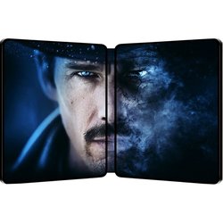
Predestination (Blu-ray SteelBook) [UK]

Noodles

Super Moderator
Premium Supporter
Feb 28, 2011
43,073
UK
Purchase:
Zavvi - £19.99
Base - £14.99
Release: June 1st, 2015
Notes: Empire Online are holding another Steelbook design competition... See here for full details.
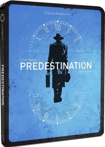
We're giving you the chance to design the cover for the Predestination Steelbook Blu-ray. Your artwork will be immortalised in steel - and available to buy from major retailers if you impress the judge, Ethan Hawke himself.

The Oscar-nominated actor will choose his favourite artwork for the Home Entertainment release of Predestination and Signature Entertainment will turn it into the steelbook cover of the film, crediting your name on the packaging.

You'll also win copies of the Blu-ray and a 10 film sci-fi bundle also courtesy of Signature.
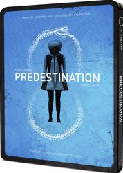
front.jpg

back.jpg interior.jpg
 
Last edited by a moderator:
Just noticed on the new Artwork, the Roman Numerals on the clock face art, why is it XXI at the 12 o'clock position ?

It correctly goes from 1 to 11 correctly , then suddenly XXI (21), is this a cock-up or related to the film, because, I've seen the film yesterday, and I can't see any link.

Hopefully it will be corrected if a balls-up, if it is related, someone like to explain ?!

Good catch!!! ...Must have been a mistake on the Artist's part. Should be XII... Can't think of any reason why it should be 21.
 
If you can't see a similarity, may I recommend Specsavers.
Funny you say that... as I actually work for my local Specsavers in Wales. Heh. Personally I don't think two characters carrying items with their backs turned to us constitutes as plagiarism (one is carrying a guitar case and a briefcase whilst the other is carrying a briefcase and an umbrela, different hats and so on). Besides. the person who made this artwork took that image of Hawke from an official Predestination poster. So basically you're telling me no-one is allowed to have a character with their back turned. Heh.

Screen_shot_2015_04_16_at_20_09_18.png


If you ever need an eye-test done... I'm your man :p
 
Last edited:
Funny you say that... as I actually work for my local Specsavers in Wales. Heh. Personally I don't think two characters carrying items with their backs turned to us constitutes as plagiarism (one is carrying a guitar case and a briefcase whilst the other is carrying a briefcase and an umbrela, different hats and so on). Besides. the person who made this artwork took that image of Hawke from an official Predestination poster. So basically you're telling me no-one is allowed to have a character with their back turned. Heh.

Screen_shot_2015_04_16_at_20_09_18.png


If you ever need an eye-test done... I'm your man :p
Silhouette of a man in a long coat and hat, carrying a case and walking directly away from the viewer, against a blue background. You're right, they're totally different :rolleyes:
 
Silhouette of a man in a long coat and hat, carrying a case and walking directly away from the viewer, against a blue background. You're right, they're totally different :rolleyes:
You're really gonna keep this going? Heh. That silhouette you speak of is taken from official promotional material for the film. So can't you understand that using the word plagiarism is just laughable in this instance? The guy who made the steelbook artwork did not steal that from that 'Being There' poster you posted there... because he didn't create that element of the artwork. Sure, they both have the same blue background but that's all that is definitively similar because the clothes and the case and all that is all part of Ethan Hawke's character in the sodding film. And I see countless posters where there's a character walking directly away from the viewer. I mean, don't you?
 
  • Helpful Post
Reactions: liam freedman
You're really gonna keep this going? Heh. That silhouette you speak of is taken from official promotional material for the film. So can't you understand that using the word plagiarism is just laughable in this instance? The guy who made the steelbook artwork did not steal that from that 'Being There' poster you posted there... because he didn't create that element of the artwork. Sure, they both have the same blue background but that's all that is definitively similar because the clothes and the case and all that is all part of Ethan Hawke's character in the sodding film. And I see countless posters where there's a character walking directly away from the viewer. I mean, don't you?
I said the artwork is plagiarism, in the same way that the Saul Bass "inspired" winning artwork from the 'Whiplash' competition was. I didn't say it was the guy that made the steelbook artwork that stole from the 'Being There' poster. Theft of other people's ideas may be commonplace in the advertising industry, of which movie posters are a part, but that doesn't mean it shouldn't be called out.
 
I said the artwork is plagiarism, in the same way that the Saul Bass "inspired" winning artwork from the 'Whiplash' competition was. I didn't say it was the guy that made the steelbook artwork that stole from the 'Being There' poster. Theft of other people's ideas may be commonplace in the advertising industry, of which movie posters are a part, but that doesn't mean it shouldn't be called out.
But the first sentence there contradicts the second sentence, surely? If the artwork is plagiarism and there's only person who made that artwork then why the need to point out that you didn't say that the fault lies with the guy that made the artwork and all that. Honestly, and there's no offence intended here... but there's a bit of tunnel vision with your thoughts on this. Theft of other people's ideas is definitely commonplace in the advertising industry... but certainly not here, for sure.

All that's happened here is that a person took (from official promotional material) the silhouette image of Ethan Hawke who just happens to have his back to us and just happens to be carrying similar items to the figure in the 'Being There' poster. He also happens to be wearing slightly similar clothing, a hat and a long coat. But these items and clothes are part of the character in the film. He also made the background blue but if you head to Google and search in the images section for Predestination you're greeted with quite a fair bit of promotional material where the colour scheme is... very, very blue. The colour is also prominent in the film itself - Ethan Hawke's character wears a blue hat for example. There's the scenes where Sarah Snook is going through training and she and others are wearing a blue and white outfit. So it makes sense that the background is blue and not, say, red for example.

I could go on but I'm happy to leave it there if you want to, you know? Because we're both going around in circles here... but I'll be very surprised if any of this plagiarism talk lasts beyond this page... and that will say it all really.
 
  • Like
Reactions: justhedudeman
Good catch!!! ...Must have been a mistake on the Artist's part. Should be XII... Can't think of any reason why it should be 21.
Indeed, I messaged the designer via the site he submitted it on to mention it.
 
Last edited:
  • Like
Reactions: kaw
I think the artwork for this is pretty good; clean and cool. Don't know much about the film though - is it worth a blind buy? Also, never bought anything from Base before. Where are they (ahem) based and what's their service/packaging like. At that price I might be tempted...
 
But the first sentence there contradicts the second sentence, surely? If the artwork is plagiarism and there's only person who made that artwork then why the need to point out that you didn't say that the fault lies with the guy that made the artwork and all that. Honestly, and there's no offence intended here... but there's a bit of tunnel vision with your thoughts on this. Theft of other people's ideas is definitely commonplace in the advertising industry... but certainly not here, for sure.

All that's happened here is that a person took (from official promotional material) the silhouette image of Ethan Hawke who just happens to have his back to us and just happens to be carrying similar items to the figure in the 'Being There' poster. He also happens to be wearing slightly similar clothing, a hat and a long coat. But these items and clothes are part of the character in the film. He also made the background blue but if you head to Google and search in the images section for Predestination you're greeted with quite a fair bit of promotional material where the colour scheme is... very, very blue. The colour is also prominent in the film itself - Ethan Hawke's character wears a blue hat for example. There's the scenes where Sarah Snook is going through training and she and others are wearing a blue and white outfit. So it makes sense that the background is blue and not, say, red for example.

I could go on but I'm happy to leave it there if you want to, you know? Because we're both going around in circles here... but I'll be very surprised if any of this plagiarism talk lasts beyond this page... and that will say it all really.
Fcuk me, I give up :banghead:
 
  • Informative
Reactions: Dan Kyte
I think the artwork for this is pretty good; clean and cool. Don't know much about the film though - is it worth a blind buy? Also, never bought anything from Base before. Where are they (ahem) based and what's their service/packaging like. At that price I might be tempted...

I recommend giving the movie a watch before. I enjoyed it but it could be a little weird for others.
 
The artwork could have been better but with the choices they make for the winner could be worse too, I'd rather wait for the Kimchidvd exclusive, for me this movie is worth the extra cost.
 
I hope Kimchi do release different artwork for this. I still route for a lenti edition with the different characters reflecting.
 
I sent a message to Dan (the competition winner) asking if the XXI was an oversight or not, here's the reply I got:

Hi,
Thank you for your message. I did have my reasons for using 21 but I can understand the confusion.

I originally wanted to add an element that people could take it as they liked and try to work out why it was 21. Much like what the film achieves.

My take on the events in the film are that the time travel paradox is a kind of glitch that wouldn't be able to occur along a regular timeline.
Hence jumping from XI to XXI as a glitch instead of XII.

The fact that as you go through the cycle of time and this glitch keeps occurring, is also symbolic of the snake eating its own tail (which I show on the back cover)

I also thought 21 taken as its 2 numeric characters 2,1 could represent Sarah and Ethan's characters...
actually being the same person. Two becoming one.

Personally I think I was trying to be too clever for my own good and am beginning to regret not just putting 12 instead. I have provided an option of the artwork with 12 on it as an alternative but I left it up to Signature to choose which to use.

Hope this helps spread some light on the matter.

All the best,
Dan


/cc @Mr Y Fronts @kaw
 
Last edited: