The UGLIEST Blu-Ray SteelBook thread

Wreck

Is Here To Serve
Staff Member
Jan 26, 2009
32,990
USA
This should be a fun topic ...

What is the ugliest steelbook you've come across?

Post a pic while your at it. (google search is your friend)

---------- Post added at 12:26 PM ---------- Previous post was at 12:23 PM ----------

Here's my pick.
pic removed to remove thumbnail

Awesome movie, and maybe my decision to this is that the other 2 editions just looked much better. Oddly enough, its the only version of Kick Ass I even own.

---------- Post added at 12:26 PM ---------- Previous post was at 12:26 PM ----------

I'm also not a fan of the Star Trek steel, I think something better could have been done with both of these.
 
Last edited by a moderator:
  • Like
Reactions: NoDingsNoScratches
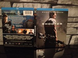
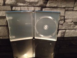
The pretty german Shooter steelbook :hilarious:
 

Attachments

  • Foto 1.JPG
    Foto 1.JPG
    91.5 KB · Views: 129
  • Foto 2.JPG
    Foto 2.JPG
    75.7 KB · Views: 137
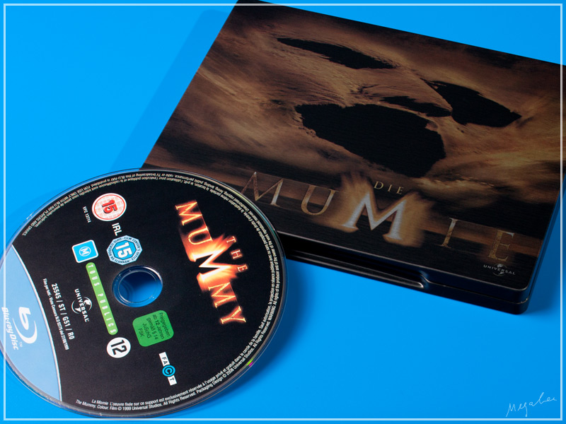
I'm not that much in collecting ugliest steels, so from what had in hands some time I can only nominate this one.

demumie1.jpg
 
My pick!

The Wolf of Wall Street US Target Exclusive... Too much DAMN yellow! EEK!


I totally agree. Speaking of Leonardo DiCaprio and too much yellow or gold. I think The Great Gatsby steelbook is pretty ugly as well. I don't know if it has been posted already because I haven't gone through the pages but here are some pics. I think the group cover was originally planned for the steelbook and then they changed it to the Gatsby close-up after everyone had already pre-ordered. The group cover is on the Taiwan metalpak if any one is interested. I do think the other cover with just Gatsby would have looked better as well.

Final cover:
10839233-1379333570-976600_zps33464b51.jpg


The group cover:
http://i942.photobucket.com/albums/ad268/gman9381/The-Great-Gatsby-br-uk-3D_zpsc0100858.jpg

Another Gatsby cover:
http://i942.photobucket.com/albums/ad268/gman9381/thegreatgatsby_zps61b9885f.jpg

---------- Post added at 06:43 PM ---------- Previous post was at 06:18 PM ----------

Oh! I just thought of another one. The Brave Fnac steelbook. Yes, that is a border on the steelbook, not a slip cover so it won't come off. Why they decided to make a border with the words Blu-ray 3D on it is beyond me. They even made it worse by putting multiple 3D logos in the border. I like the art but the border just ruins it.

brave-fnac-exclusive-release_zps9acfc4be.jpg
 
Last edited by a moderator:
gladi fr

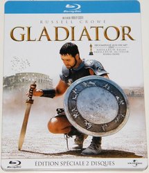
Here is an ugly basterd : The French Gladiator steelbook !!

There is the ugly blue banner on top, with the written text on it...
And then the image is so pixellated that you have to know it to recognize Russell Crowe's face...

To sum it up, one steelbook you definitely want to avoid.

By the way, does someone know if there is a "most beautiful steelbooks" topic, as I would very much like to hear opinions on this matter.
 

Attachments

  • gladiator-blu-ray-steelbook-fr-01.jpg
    gladiator-blu-ray-steelbook-fr-01.jpg
    114.3 KB · Views: 113
I just don't know what Disney/Marvel is thinking. They could've done much better.

null_zps7eecbe73.png


I'm afraid of what the rest of Phase two is gonna look like

I can tell you exactly what they were thinking!

Avengers - Actors too busy to sign off on any new art / cant hold up the deal / throw an A on it and no need to get any approvals.
IM3 - Throw an IM symbol on it of some sort ... no need for approvals - seal deal.
Thor 2 - We got any approved art from Hemsworth? Put that on it and call it a day ...otherwise throw a hammer on it.

Happens all the time .... look at all the Wolf of Wall St steels .... wolf logo, dollar signs ... etc. or... there's like 2-3 images approved to choose from.
 
Oh! I just thought of another one. The Brave Fnac steelbook. Yes, that is a border on the steelbook, not a slip cover so it won't come off. Why they decided to make a border with the words Blu-ray 3D on it is beyond me. They even made it worse by putting multiple 3D logos in the border. I like the art but the border just ruins it.

brave-fnac-exclusive-release_zps9acfc4be.jpg


..and this is an ugly JUMBO SteelBook as well and not because of the disc count (only 3) no.. because they wanted to put the stupid little book inside as well :wtf:
 
I can tell you exactly what they were thinking!

Avengers - Actors too busy to sign off on any new art / cant hold up the deal / throw an A on it and no need to get any approvals.
IM3 - Throw an IM symbol on it of some sort ... no need for approvals - seal deal.
Thor 2 - We got any approved art from Hemsworth? Put that on it and call it a day ...otherwise throw a hammer on it.

Happens all the time .... look at all the Wolf of Wall St steels .... wolf logo, dollar signs ... etc. or... there's like 2-3 images approved to choose from.

Couldn't agree more :hilarious::thumbs:
 
I have to defend the finish of WoWS. While the artwork is basic, the embossing, gloss, debossed back, and metallic $$$ all look amazing. The finish almost seems to have a red sheen to it. It's hard to explain unless you hold it in hand.

I like it personally.

---------- Post added at 02:26 AM ---------- Previous post was at 02:14 AM ----------

I'll add steelbooks where they clearly switched the front and back cover:
bwpn.png


The rest of that Batman line to prove my point.
s7eb.png

zzd9.png

9t5m.png
 
  • Like
Reactions: lolwut and Greyback
I have to defend the finish of WoWS. While the artwork is basic, the embossing, gloss, debossed back, and metallic $$$ all look amazing. The finish almost seems to have a red sheen to it. It's hard to explain unless you hold it in hand.

I like it personally.

---------- Post added at 02:26 AM ---------- Previous post was at 02:14 AM ----------

I'll add steelbooks where they clearly switched the front and back cover:
bwpn.png


The rest of that Batman line to prove my point.
s7eb.png

zzd9.png

9t5m.png

Looks to me like a case of them realizing that matching the placement and size of the other steels would have ruined the question mark.
 
Looks to me like a case of them realizing that matching the placement and size of the other steels would have ruined the question mark.

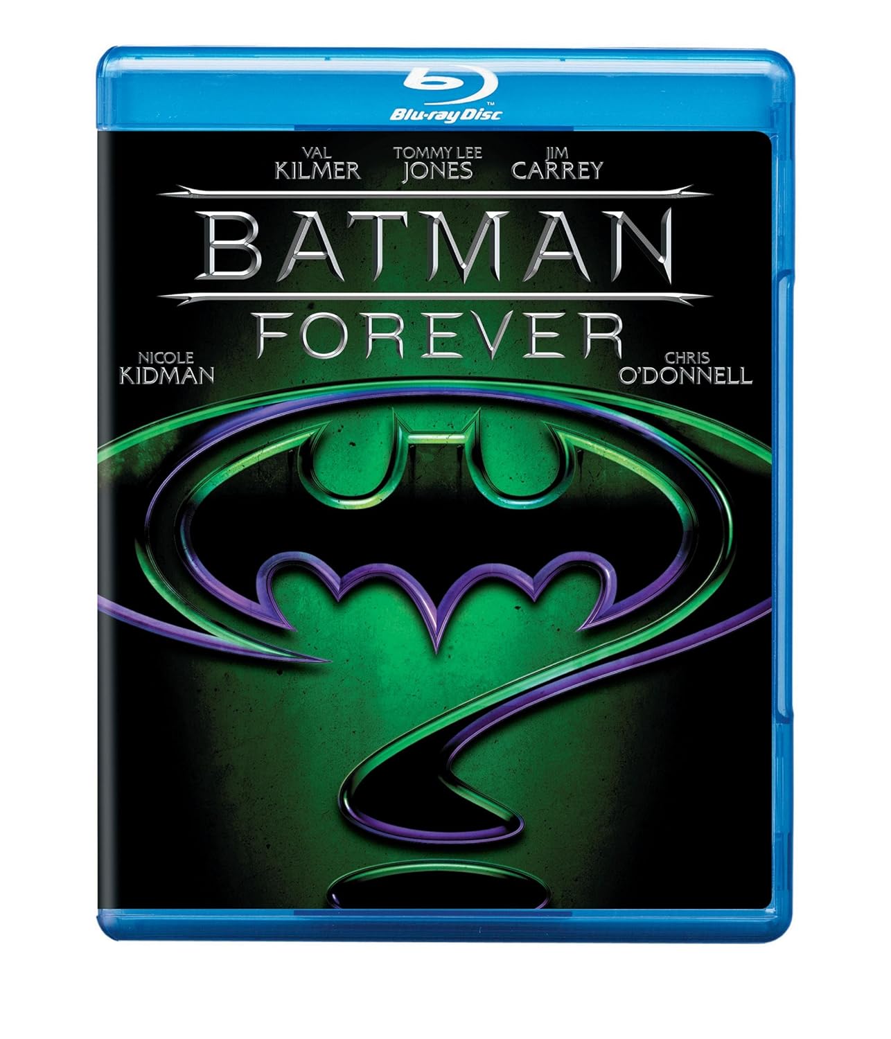
Except they released blu-rays with the proper front:
81ccTP7h1wL._SL1500_.jpg


And the sides are cut off on all of them, so why would it matter if the bottom is a little cut off?

Truly I think this was a blunder.
 
  • Like
Reactions: dv8mad