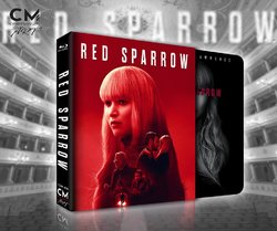
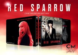
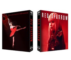
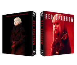
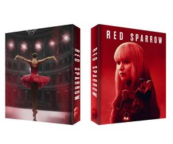
Red Sparrow (Blu-ray SteelBook) (Cine-Museum Art #02) [Italy]

What cover setup do you like best?

  • Choice A

    Votes: 10 15.2%
  • Choice B

    Votes: 7 10.6%
  • Choice C

    Votes: 11 16.7%
  • Choice D

    Votes: 38 57.6%

  • Total voters
    66
  • Poll closed .

tommyh84

Not Mine
Premium Supporter
Apr 28, 2011
10,213
Release date: 22-25 August 2018
Purchase link: CineMuseum - (Pre-order July 7 at 2:30 PM Italy time, GMT +2) - Find your local timing HERE
Group buy:
hosted by Aniv
Note: Print run 200
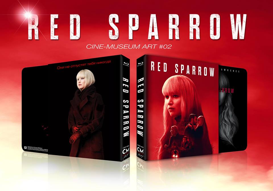
35490878_10217095150797909_8645978095532113920_n.jpg

35464610_10217095149277871_7005901475859660800_n.jpg35544809_10217095149157868_5858502732259786752_n.jpg35429635_10217095150197894_8407279120483876864_n.jpg
giphy.gif
34602623_1268173166646845_4104906115454599168_o.jpg34793131_10217025100206688_8114351853996605440_n.jpg34866669_10217025100086685_2597705793826455552_n.jpg34847111_10217018428079889_8678828801435631616_o.jpg
 
Last edited by a moderator:
If memory serves me correctly wasn’t the Blufans - Big Hero 6 Hollow Cut designed by a fellow Ninja? While I’ve never seen it in hand, I have seen an unboxing of it and looks like quite nice of a release. It worked on that release as it was Animation based and obviously that guy/gal has some real talent.

I appreciate the effort that has gone into this don’t get me wrong but the fan art is it’s biggest downfall as it’s amateurish at best. Looks photoshopped without using layers to the image to give in that sense of depth. JLaw looks like she has been inserted into the forefront of the image and damn what’s going on with that hat she’s wearing as it looks out of place with what it looks like “aliasing” along the edge where it meets her forehead and the way it cuts away around her left ear seems odd aswell.

I really do hope you listen to some of the feedback on this thread or atleast take it into consideration and reconsider going with the offical artwork instead as that Slip looks gorgeous :drool:
 
First of all we want to thank everyone for participating in the discussion and for providing many elements for reflection.
From what we read and doing a quick summary, the colelectionists prefer an official impact artwork for the frontal lenticular effect and artistic and also experimental artworks for the back.
We substantially agree with this vision and it is the track we would like to follow to continue with the Art line, waiting to be able to propose WEA steelbooks to enrich the offer.

For this reason we offer 2 new alternatives that we would like to discuss with you and that are certainly derived from images approved by FOX.

34793131_10217025100206688_8114351853996605440_n.jpg

34866669_10217025100086685_2597705793826455552_n.jpg


In the end, the best thing for those who buy a limited edition, is to have helped to realize it!
 
Wow, two excellent choices. While I think the ballerina back will probably get more votes, I prefer the second option by a hair because it’s just an excellent shot of Jen. I’d definitely buy either one.

Thank you for listening to our feedback. :)
 
Wow, two excellent choices. While I think the ballerina back will probably get more votes, I prefer the second option by a hair because it’s just an excellent shot of Jen. I’d definitely buy either one.

Thank you for listening to our feedback. :)

I agree both are much better. I would buy either as well the cover is excellent. As far as the back I would also bet the ballerina gets slightly more votes but would be happy with either. I don't have a strong opinion one way or another. Well done.
 
Hi, our line is called "Art" because we try to offer alternative artworks and we're still waiting for approval.
For The Untouchables we have proposed a work created by an English artist, we would like to do the same with Red Sparrow.
We had some options using official artworks:

34847111_10217018428079889_8678828801435631616_o.jpg

Is this one still on the cards ^^^^ or has it been replaced with the new variant of the ballerina back? I’m still in love with this one as it’s a beautiful shot that is elegant and well cropped which has great contrast to the image. If it’s no longer available I still prefer the ballerina back just ... but I must admit that’s a very fine shot of JLaw on the second one :drool:. What these #2 and #3 backs have over #1 ballerina back is the Russian text, thats a really nice touch :thumbs:

Thanks a ton for taking the feedback on board it’s much appreciated :thumbs: I look forward to your future releases aswell as your vision on captivating the artwork is on key.
 
Last edited:
First of all we want to thank everyone for participating in the discussion and for providing many elements for reflection.
From what we read and doing a quick summary, the colelectionists prefer an official impact artwork for the frontal lenticular effect and artistic and also experimental artworks for the back.
We substantially agree with this vision and it is the track we would like to follow to continue with the Art line, waiting to be able to propose WEA steelbooks to enrich the offer.

For this reason we offer 2 new alternatives that we would like to discuss with you and that are certainly derived from images approved by FOX.

34793131_10217025100206688_8114351853996605440_n.jpg

34866669_10217025100086685_2597705793826455552_n.jpg


In the end, the best thing for those who buy a limited edition, is to have helped to realize it!

Second out out of those please :thumbs:

I'd also like for you to make the spine less busy, maybe just drop the font sizes down a bit :)
 
Still think the first shown with official art, with her performing as ballerina, is the definitely best one. The other ballerina in second.

Thanks for listening. :thumbs:
 
  • Thanks
Reactions: willbar84
I've got to say I thought all the criticism wasn't going to "help" a new retailer but I'm very happy to see that it's been taken constructively. CM is on the right track! Good for you for listening even if it's going a little (well, a lot) against your "art" line. So, is this still going to be in the art line if you go all official?
My preference would be the 2nd design out of the 4 shown. The only thing missing on that one is the Cyrillic text. And I also agree with tommyh84, if you drop down the CM and Fox logos a little it will make the title stand out a little more while still getting to see the logos.

And damn, I'm not on the fence any longer. I now want this for sure.
 
If you do end up going with the 3rd design, the one with the ballerina and eagle, is there any way you can place the eagle elsewhere and center the text?
 
As for me, this art is look better than all the rest:
89 (2).jpg


But:
1. Do not need more Jennifers on the spine...
20-th Fox and CM logos on the spine will be better.

2. When the movie-logo is not crossing the Jennifer head = much better.

3. Colours...
I think, the better choise = totally red slip.
Do not need to do black spine or black back.
We have already all-black Steelbook inside, by the way...
As for me, totally red slip = the best.

4.
Cyrillic text...
"Они не отпустят тебя никогда" = too banal slogan...
"They will never let You go".... Really?... :rolleyes:

Maybe, using the movie-logo in Russian on
the spine and even on the front will be better?...
And we will have "laconic" cyrillic slip :pompus:
redsparrowlogo.png
 
Please not on the spine :p Some of us don't read cyrillic and I need to place it in alphabetical order or I'll just go mad.

All wanted cyrillic, so))...

Alphabetical order...
My friend, if this one release will be with cyrillic on the spine,
I think You will newer miss this release in Your collection!))))

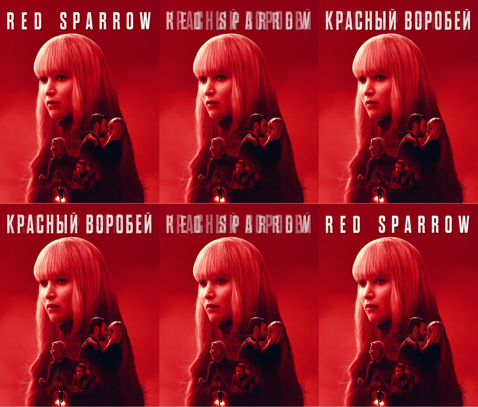
By the way, an idea = it will be a nice lenti-effect for front:
LENTI3.gif
 
All wanted cyrillic, so))...

Alphabetical order...
My friend, if this one release will be with cyrillic on the spine,
I think You will newer miss this release in Your collection!))))

By the way, an idea = it will be a nice lenti-effect for front:
View attachment 377714
I'd be happy to have cyrillic text on front and/or back, doesn't make sense to have foreign text on the spine of an American movie though.