Rush (Blu-ray SteelBook) [UK]

snooloui

The 'Negative' Ninja
Premium Supporter
Feb 12, 2012
12,034
UK
Release date: January 27th, 2014
Purchase links:
Amazon.co.uk
Base.com
Sainsbury's
Zavvi
Region coding: B
Group Buy - CLICK HERE < hosted by Naughtius Maximus
61TsHtjtJHL._SL1500_.jpg


Additional info from Noodles

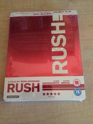
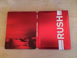
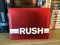
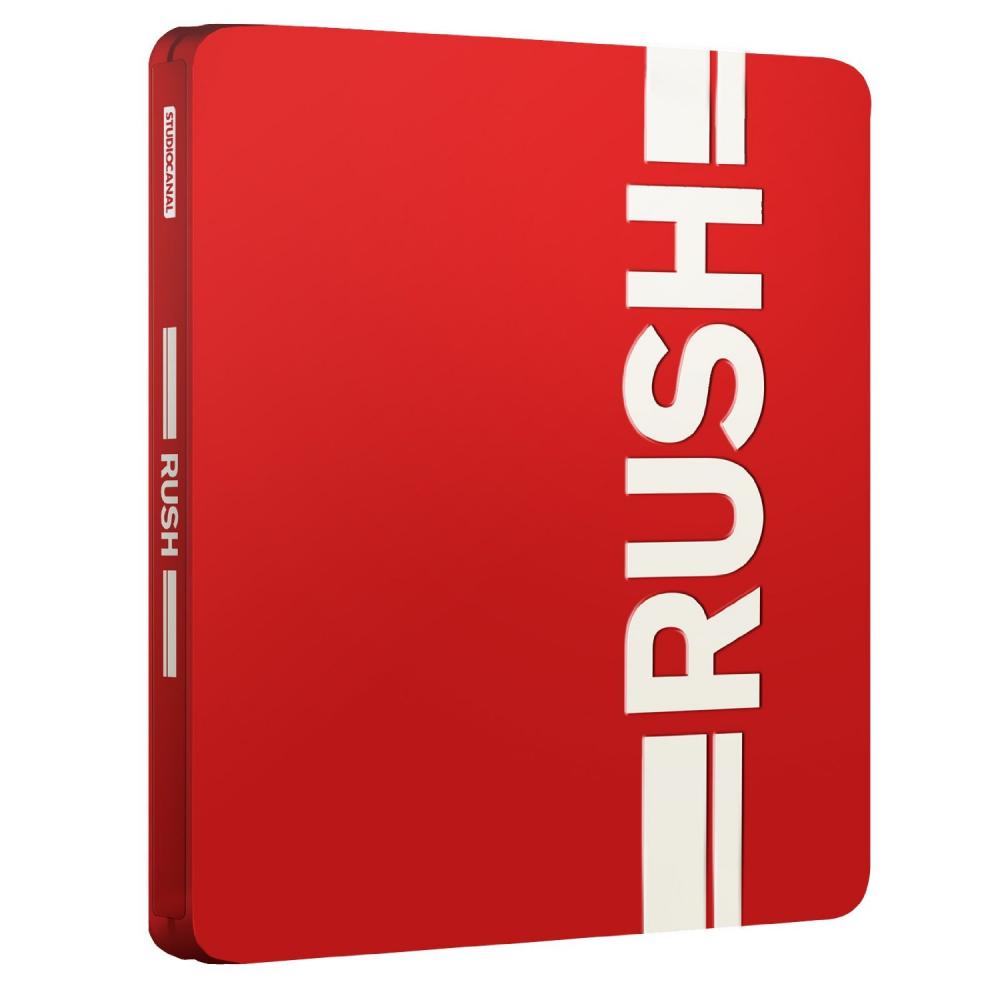
Just been chatting to Elliot Cardona (the guy who designed the artwork) and he confirmed that this has "a matte finish with a Pantone red and embossed lettering." Shame it's not gloss, but I can live with it being matte because I like the artwork so much. Can't wait for this one!

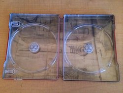
Actual Photoshots courtesy of paulboland.
1496946_10202828772100926_1667782533_n.jpg

11507_10202828773260955_1126130939_n.jpg

1622858_10202828773140952_1548283578_n.jpg

1509763_10202828773300956_1288114050_n.jpg
 
Last edited by a moderator:
Not the case with Sewage Canal who seems to be favoring poor matte finish. There were few concept artworks for this movie that looked terrific and it is a shame that they chose to do a low key plain design. Worst part is the back is going to look even more dul and hazyl if the matte finishing is not of high quality.
 
:wtf:

Theres been more gloss finishes the last few weeks than there has in the past year?

True. The new ALIEN release is gloss and makes a point of saying so. At least they know what we want and will give it some of the time. If we don't buy the mattes they will stop producing them... saying that I do like a mix of gloss and matte (DRIVE for example).
 
As I've said before, there is nothing wrong with a matte finish. In some instances, it works wonderfully. However it seems that lately the paint on them is extremely 'thin' and thy end up looking a bit streaky and washed out.

An example of a nice thick matte finish is the recent blufans 'Face/off'.
 
Hope it's a good matte, really should be gloss though with this minimalist artwork but at least the title is embossed which I didn't expect from Studiocanal, so that's a plus.
 
As I've said before, there is nothing wrong with a matte finish. In some instances, it works wonderfully. However it seems that lately the paint on them is extremely 'thin' and thy end up looking a bit streaky and washed out.

An example of a nice thick matte finish is the recent blufans 'Face/off'.

I'm quite new to this so haven't seen all types of finishes. An example of a matte finish I did like is Fincher's 'Girl With The Dragon Tattoo' (the stunning artwork helps). One I think looks a little cheap is "Pacific Rim'.
 
the designers went all out on this one... :p

Designers they were in a Rush to come up with the artwork:joy: :D


Note Lenticular slipcover with red amaray case
91fLSt-YvDL._SL1500_.jpg


91PZCTNoOmL._SL1500_.jpg


81hGlaknYsL._SL1500_.jpg
This looks might be good tempted to get Lenticular slipcover with red amaray case and the steelbook

I ordered both my bank account is getting hit hard for Jan-March for orders EEK!
 
Last edited:
Designers they were in a Rush to come up with the artwork:joy: :D


Note Lenticular slipcover with red amaray case
91fLSt-YvDL._SL1500_.jpg


91PZCTNoOmL._SL1500_.jpg


81hGlaknYsL._SL1500_.jpg
This looks might be good tempted to get Lenticular slipcover with red amaray case and the steelbook

I ordered both my bank account is getting hit hard for Jan-March for orders EEK!
FYI: The same guy (Elliot Cardona) that designed the steelbook also designed that slip. He did more concepts for the steelbook (see here), but this is obviously what the studio decided to go with in the end.
 
Thanks for that noodles. Very interesting. Having seen that they could have done 2 versions the green James hunt version and the red niki Lauder version.