Justice League (3D+2D Blu-ray SteelBook) (HMV Exclusive) [UK]
- Thread starter Noodles
- Start date
You are using an out of date browser. It may not display this or other websites correctly.
You should upgrade or use an alternative browser.
You should upgrade or use an alternative browser.


")


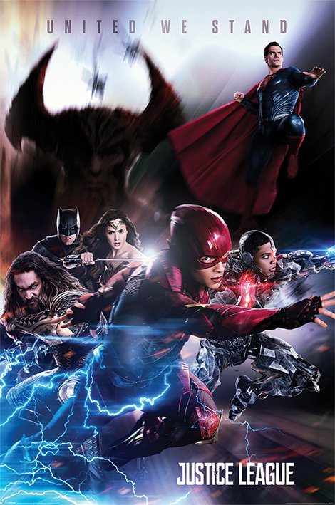
Like that!! Has an Avengers vibe about it. tbh all the movie posters sucked for this film so for me this is the best they could do
$300m budget and still can't get anything right related to the film
 Shocking
 I’d actually like the the poster on the precious page as the front (basically the inside mug shot art).
I don’t mind the back but that front is bad. Just like the avenger ones
Will wait for the manta exclusive
Looks alright to me, not great but not ****. Would be good with spot gloss on all the obvious parts
spot gloss would be nice but i doubt warner would do any treatment on there WWA steelbooks... when was the last time we've got good WWA steelbooks from them? i really can't remember...
Last edited:
I like how the chosen final design links in with the film...disappointing
Artwork neither bland nor boring although slightly put off by the wonkiness of the "JL" logo on the front.
Cool and creative design as back art
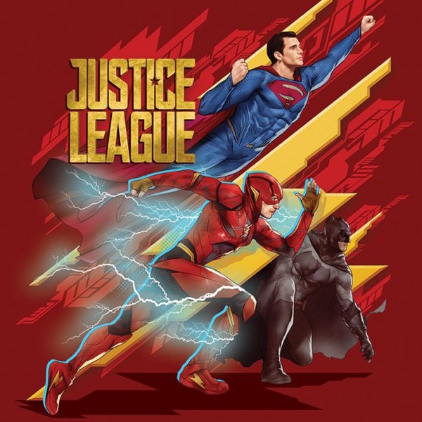
Inside with original poster design looks fine although wish the chunk of text was absent and left to the J-card only.
Not saying I prefer "JL" artwork surrounded by the characters . . . and maybe would have preferred "JL" straight and central to allow for embossing/de-bossing of image:-
 ...
...

As for that big ass "DC" logo on the front - surely by now could be on the spine only!?
As for the eventual premium lenticular Full Slip there's one that should look good if done right:-
As for the premium Full Slip there's at least these two:-
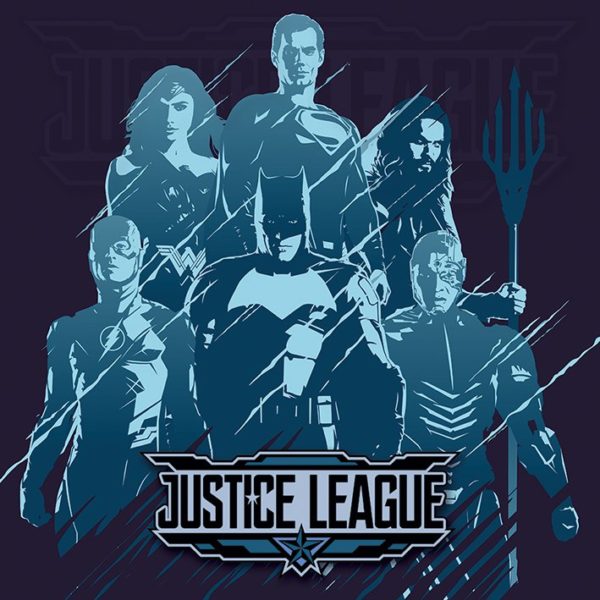
Cool and creative design as back art
Inside with original poster design looks fine although wish the chunk of text was absent and left to the J-card only.
Not saying I prefer "JL" artwork surrounded by the characters . . . and maybe would have preferred "JL" straight and central to allow for embossing/de-bossing of image:-
As for that big ass "DC" logo on the front - surely by now could be on the spine only!?
As for the eventual premium lenticular Full Slip there's one that should look good if done right:-
As for the premium Full Slip there's at least these two:-
I like the back and inside, but the front is boring, no worse than the first two Avengers steels or the first Civil War though. I also have the FNAC edition ordered so hopefully they'll get different art.
Similar threads
- Replies
- 0
- Views
- 501
- Replies
- 1
- Views
- 639
- Replies
- 28
- Views
- 3K
- Replies
- 44
- Views
- 3K